Day 36 - Examples of projection
Last time we discussed two ways to project multivariate data for
visualization: Principal Components Analysis (PCA) and discriminative
projection (types m, v, and mv).
Today we will use these methods to analyze some datasets, as well as
introduce some new functions.
Handwritten digit recognition
We looked at several projections of this dataset last time, and found that
the class boundary was quadratic.
This explains why linear logistic regression didn't work very well.
Another way to diagnose problems with logistic regression is to look
directly at the classification boundary it is using.
Recall that logistic regression uses a model of the form
p(y=1|x) = sigma(a + b1*x1 + b2*x2 + ...)
The argument to the logistic function is a projection of the data onto one
dimension. If the projection exceeds zero, then the classifier says class
1, otherwise class 2.
By choosing a second projection dimension, e.g. using one of the
discriminative criteria (m/v/mv), we can see how the data is
distributed around that boundary. The function
cplot.project.glm will do this, if you give it a logistic
regression fit. Here is the result on the digit problem:
fit <- glm(digit8~.,x8,family=binomial)
cplot.project.glm(fit)
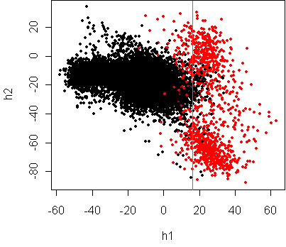
Logistic regression has done its best to fit a linear boundary, but
clearly a curved boundary would be more appropriate.
Diabetes
Let's look again at the diabetes dataset from day31:
> x[1:5,]
  npreg glu bp skin  bmi   ped age type
1     5  86 68   28 30.2 0.364  24   No
2     7 195 70   33 25.1 0.163  55  Yes
3     5  77 82   41 35.8 0.156  35   No
4     0 165 76   43 47.9 0.259  26   No
5     0 107 60   25 26.4 0.133  23   No
> w <- projection(x,2)
Projection type mv
> cplot(project(x,w))
fit <- glm(type~.,x,family=binomial)
cplot.project.glm(fit)
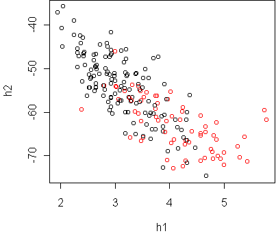
Both projections show that the classes are ellipsoidal and
have significant overlap. Hence we cannot expect a low test error rate,
with any classifier. It seems that a logistic regression classifier is
sufficient.
An extra bit of information revealed in these plots is that the red class
(diabetes) has a larger degree of variation,
especially as you move farther away from the black.
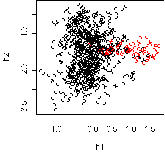
Vehicle classification
In the Vehicle dataset, four vehicles were observed at several
different camera angles, and the silhouette of each vehicle was extracted.
Describing each silhouette are 18 variables measuring properties like
circularity (Circ) and elongatedness (Elong). We want to
discriminate vans versus other vehicles, based on the silhouette alone.
The variable Class indicates a van.
Here is the first row:
  Comp Circ D.Circ Rad.Ra Pr.Axis.Ra Max.L.Ra Scat.Ra Elong
1   95   48     83    178         72       10     162    42
  Pr.Axis.Rect Max.L.Rect Sc.Var.Maxis Sc.Var.maxis Ra.Gyr
1           20        159          176          379    184
  Skew.Maxis Skew.maxis Kurt.maxis Kurt.Maxis Holl.Ra Class
1         70          6         16        187     197   Yes
w <- projection(x,2,type="m")
cplot(project(x,w))
w <- projection(x,2,type="mv")
cplot(project(x,w))
The Fisher projection suggests that a linear boundary is appropriate.
The mv projection shows that the classes have quite different spread,
but only along an irrelevant dimension. So it does not contradict the
appropriateness of linearity.
A quantitative comparison of logistic regression and nearest neighbor
classification on this dataset is made in homework 11.
Speech recognition
Fifteen speakers utter 11 different vowels 6 times each. The sound signal
was recorded and transformed into 9 variables measuring harmonic
properties.
We want to classify the vowel "hid" versus all others.
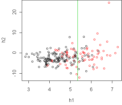
w <- projection(Vowel,2,type="mv")
cplot(project(Vowel,w))
w <- projection(Vowel,2,type="m")
cplot(project(Vowel,w))
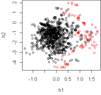
These two projections seem to contradict each other, until you realize that
the first projection is just a sideways look at the second.
This was shown in class by making a three dimensional mv projection and
rotating it in ggobi.
The classes are fairly separable if you use a curved boundary, such as
a quadratic.
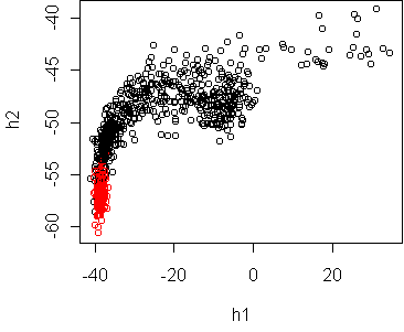
Cars
Now let's consider some datasets where there is not a designated response
variable, and we just want to understand the structure of the data. In
this situation, PCA is the appropriate projection. Consider the
Cars93 dataset from day20, excluding
non-numeric variables. Here is the first row:
              Price MPG.highway EngineSize Horsepower Passengers
Acura Integra  15.9          31        1.8        140          5
              Length Wheelbase Width Turn.circle Weight
Acura Integra    177       102    68          37   2705
We will treat Price as just another attribute of the car, not as
a response variable. Before running PCA, it is a good idea to standardize
the variables so that they have the same variance, otherwise differences in
units will distort the result.
The function scale will standardize all
variables in a data frame.
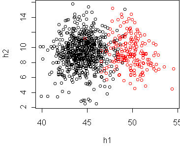
sx <- scale(x)
w <- pca(sx,2)
plot(project(sx,w))
This plot shows a funnel effect: a narrow band of cars of the left blends
into a wide band of cars on the right, with some highly unusual cars on the
bottom. To understand what variables are causing this, it helps to examine
the projection coefficients:
> w
                    h1           h2
Price        0.2561774 -0.495802418
MPG.highway -0.3017322  0.049590394
EngineSize   0.3475447 -0.090019577
Horsepower   0.2896481 -0.503803781
Passengers   0.2088062  0.630746684
Length       0.3337987  0.109095127
Wheelbase    0.3404057  0.247025091
Width        0.3520862  0.085103623
Turn.circle  0.3239262  0.108473122
Weight       0.3726352  0.005041253
The horizontal axis is h1, which has large
positive contributions from
all variables except MPG.highway, which has a large negative
contribution.
So h1 represents
the tradeoff between MPG and the other car variables, and is the
most significant way that the cars vary.
A secondary effect is captured by h2, which measures the
tradeoff between number of passengers and horsepower/price.
(Expensive sports cars tend to have a small number of passengers.)
We can see these variable contributions visually by plotting the rows of
w as vectors. This is done by the function
plot.axes:
plot.axes(w)
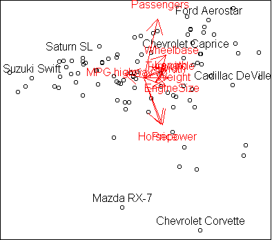
Essentially what you are seeing is the projection of unit vectors pointing
along each axis.
Vectors which line up correspond to variables which
are positively correlated. Vectors which points in opposite directions are
negatively correlated, and vectors at right angles are independent.
The funnel shape for low MPG cars means that they are relatively similar cars,
while high MPG cars can be quite different.
The variables Length, Width, EngineSize, etc. are obviously
correlated, and associated with low MPG.
At the top right we have big cars, such as minivans, that hold many
passengers. At the bottom right we have expensive sports cars.
At the bottom left and top left there are vacant regions with no cars;
high MPG cars tend not to have high horsepower, nor carry many passengers.
Because of the strong correlations among variables, we can get
a decent picture of the spectrum of cars in one two-dimensional plot.
The R-squared of the projection is 0.82.
It resembles a clustering of the cars, but it is better than clustering
because it reflects a continuum of variation.
US demographics
The following dataset, used in homework 10, has
demographic information about the 50 states:
           Income Illiteracy Life.Exp Homocide HS.Grad Frost
Alabama      3624        2.1    69.05     15.1    41.3    20
Alaska       6315        1.5    69.31     11.3    66.7   152
Arizona      4530        1.8    70.55      7.8    58.1    15
Arkansas     3378        1.9    70.66     10.1    39.9    65
California   5114        1.1    71.71     10.3    62.6    20
...
Let's analyze it using PCA, remembering to standardize the variables:
sx <- scale(x)
w <- pca(sx,2)
plot(project(sx,w))
plot.axes(w)
identify(project(sx,w))
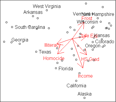
Like the cars, this dataset shows a three-way division.
On the left we have states with high illiteracy rate, high homocide rate, and
low average household income. On the top right are states with high frost
(negatively correlated with homocide) and high life expectancy.
At the bottom right are states with high graduation rate and high income.
Of course, this is only an approximate representation of the full dataset,
since we know that Alaska is pretty frosty.
Nevertheless, it is useful in showing us the general trends, in a
convenient two-dimensional plot.
The overall R-squared is 0.76.
Code
Functions introduced in this lecture:
- cplot.project.glm
- scale
- plot.axes
Tom Minka
Last modified: Thu Nov 29 21:11:15 Eastern Standard Time 2001