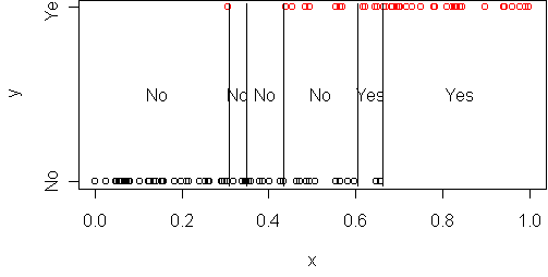
predict.plot(y~x,frame)
p(y=1|x) = a + b*xThis doesn't work because for some x it would give probabilities above 1 or below 0. The solution is to change to a different representation of probability. We could use the odds representation: p/(1-p), which ranges from 0 to infinity. That gets rid of the upper limit. We could use a log representation: log(p), which ranges from -infinity to 0. To get rid of both limits, we can use log-odds:
log(p(y=1|x)/(1-p(y=1|x))) = a + b*xSolving for p gives
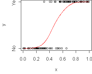
p(y=1|x) = 1/(1 + exp(-(a+b*x)))This function is called the logistic function and denoted sigma(a+b*x). This is called a generalized linear model because we've applied a transformation to a linear function. To fit this model to data, use glm instead of lm and specify a binomial family:
> fit <- glm(y~x,frame,family=binomial)
> fit
Coefficients:
(Intercept)            x
     -7.565       14.137
> model.plot(fit)
> predict(fit,data.frame(x=0.5),type="response")
[1] 0.3783538
> 1/(1 + exp(-(14.137*0.5 - 7.565)))
[1] 0.3783635
How is logistic regression done? With a numerical response, we minimized the difference between the predicted and actual values. Here it is more tricky, because we don't observe p(y=1|x) so we can't measure distance from a target. Instead what is typically done is the method of maximum likelihood, which says to maximize
sum_i log sigma(yi*(a + b*xi))where yi is the observed response, 1 or -1. It is equivalent to minimizing the deviance on the training set. This criterion does have some problems. We will talk about the properties of this criterion in the next lecture.
Because logistic regression doesn't have a specific target function, it is difficult to diagnose the fit. It is possible to define "residuals" for logistic regression but they are difficult to interpret. Consequently we will have to treat logistic regression mostly as a "black box" in this course.
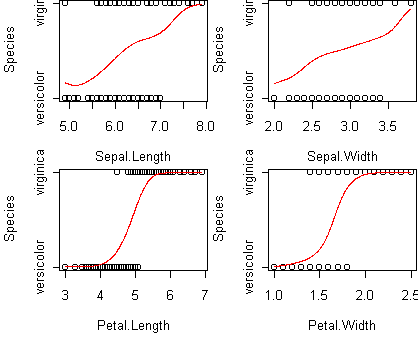
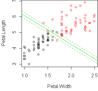
p(y=1|x) = sigma(a + b1*x1 + b2*x2 + ...)Consider the iris data from , reduced to the two classes versicolor and virginica:
data(iris)
iris <- iris[(iris$Species != "setosa"),]
iris$Species <- factor(iris$Species)
predict.plot(Species~.,iris)
> fit <- glm(Species~.,iris,family=binomial)
> summary(fit)
Coefficients:
             Estimate Std. Error z value Pr(>|z|)
(Intercept)   -42.638     25.643  -1.663   0.0964 .
Sepal.Length   -2.465      2.393  -1.030   0.3029
Sepal.Width    -6.681      4.473  -1.494   0.1353
Petal.Length    9.429      4.725   1.995   0.0460 *
Petal.Width    18.286      9.723   1.881   0.0600 .
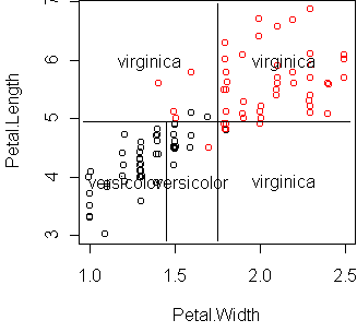
Let's do a regression with only two predictors and display it using
cplot:
fit <- glm(Species~Petal.Width+Petal.Length,iris,family=binomial)
cplot(fit)
> predict.plot(type~.,x)
> fit <- glm(type~.,x,family=binomial)
> summary(fit)
Coefficients:
             Estimate Std. Error z value Pr(>|z|)
(Intercept) -9.773055   1.769454  -5.523 3.33e-08 ***
npreg        0.103183   0.064677   1.595  0.11063
glu          0.032117   0.006784   4.734 2.20e-06 ***
bp          -0.004768   0.018535  -0.257  0.79701
skin        -0.001917   0.022492  -0.085  0.93209
bmi          0.083624   0.042813   1.953  0.05079 .
ped          1.820409   0.665225   2.737  0.00621 **
age          0.041184   0.022085   1.865  0.06221 .
Several of the coefficients are not significantly different from zero, implying
the predictors are not relevant.
To automatically prune them away, we can use step:
> fit2 <- step(fit)
Step:  AIC= 190.47
 type ~ npreg + glu + bmi + ped + age

        Df Deviance    AIC
       178.47 190.47
- npreg  1   181.08 191.08
- age    1   182.03 192.03
- bmi    1   184.74 194.74
- ped    1   186.55 196.55
- glu    1   206.06 216.06
> summary(fit2)
Coefficients:
             Estimate Std. Error z value Pr(>|z|)
(Intercept) -9.938053   1.540586  -6.451 1.11e-10 ***
npreg        0.103142   0.064502   1.599  0.10981
glu          0.031809   0.006665   4.773 1.82e-06 ***
bmi          0.079672   0.032638   2.441  0.01464 *
ped          1.811415   0.660793   2.741  0.00612 **
age          0.039286   0.020962   1.874  0.06091 .
This gets us down to five predictors.
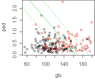
From the last iteration of step we see that glu and
ped are the most important, in the sense that removing them
causes the largest increase in deviance.
Let's look at what is happening between those two:
fit <- glm(type~glu+ped,x,family=binomial)
cplot(fit)
According to cross-validation, the best sized tree makes a single cut at glu=123.5. The deviance of this tree on the test set is 367, while logistic regression gets 318.