To remove ambiguities, we force the mean row effect and mean column effect over the dataset to be zero.
For example, consider the Virginia death rates data from day19:
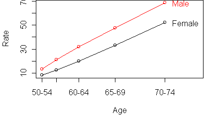
  Age Gender Residence Rate
50-54 Female     Urban  8.4
60-64 Female     Rural 20.3
50-54   Male     Rural 11.7
55-59   Male     Rural 18.1
70-74 Female     Urban 50.0
...
From recursive partitioning, we found that Age was the most relevant predictor, followed by Gender. But that leaves open the question of whether Age and Gender are additive: is the difference in rate between males and females the same, regardless of age?
We start by constructing a response table, which gives the mean response for every combination of predictors. The command rtable converts a data frame (as above) into a response table:
rtable(Rate ~ Age + Gender,x)

Rate
       Gender
Age     Female  Male
  50-54   8.55 13.55
  55-59  12.65 21.20
  60-64  19.80 31.95
  65-69  33.00 47.80
  70-74  52.15 68.55
If Rate is a purely additive function of Age and Gender, then
there exist numbers, call them effects, which we can associate with
the rows and columns of the table, such that cell (i,j) is the effect for i
plus the effect for j.
In particular, this means that
the Male column should be the
same as the Female column, except for a shift across the entire
column.
It also means that the Age rows differ only by a shift across the entire row.
Additivity is a kind of "independence" for
response tables, because it means that the predictors have independent
effects on the response.
This is a very restrictive model, that most response tables will not satisfy.
But sometimes a simpler and more constrained model can teach us more about the
data, even if it doesn't fit as well.
This table is not exactly additive, but that could be due to a limited sample. Given the sample size, there is an F-statistic, described in Moore & McCabe, which can be used to test if additivity holds in the population. This kind of binary decision is not useful for data mining, for the same reasons as the chi-square test for contingency tables. It is more useful to know how close the data is to being additive and where the departures from additivity lie.
y <- rtable(Rate ~ Age + Gender,x)
profile.plot(y)
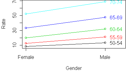
profile.plot(t(y))
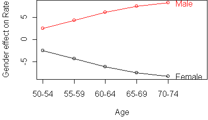
To get a better look at the deviations from additivity, we use the standardized profile plot. Instead of plotting the responses versus the column means, we subtract the column mean from each response. This levels out the curves so that they are horizontal. In a purely additive table, the curve for each row would be a straight horizontal line.
profile.plot(t(y), standard=T)
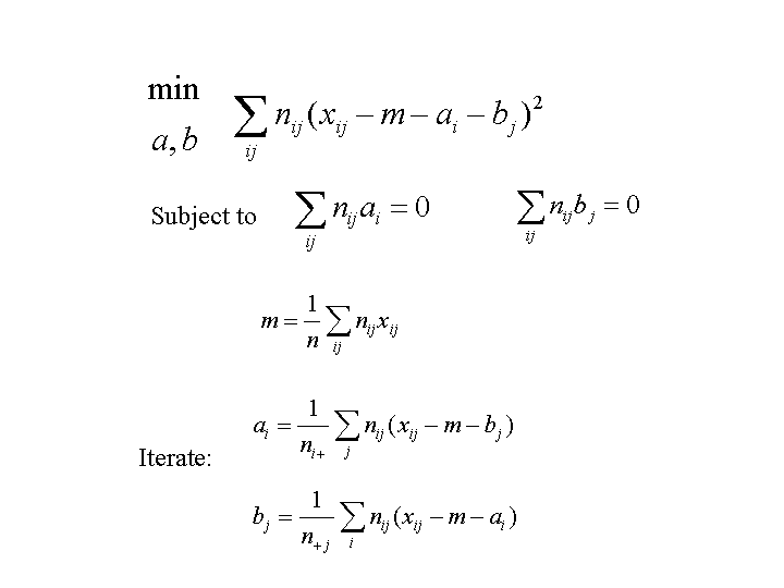
Let xij be the mean response in cell (i,j), ai be the effect for row i, and bj be the effect for column j. It is conventional to remove the overall response mean from the effects, so that they represent deviations from the overall mean. If the overall mean is m, then the additive model assumes that, for true means xij:
xij = m + ai + bjIn practice, we don't have the true means but only observed means. Furthermore, each observed mean is computed from a subset of the data corresponding to predictor combination (i,j).
If
we assume the responses are normal and have the same variance for every
predictor combination, then the quality of the fit can be measured by a sum
of squares cost function:
To remove ambiguities, we force the mean row effect and mean column effect
over the dataset to be zero.
Here is the algorithm:
A useful special case of this procedure is when all cell counts are the same: nij = constant. This often happens in designed experiments. The updates for the effects simplify to:
row effect = row mean - overall mean
column effect = column mean - overall mean
In other words, there is no iteration needed; we can estimate the effects in one step, by computing the marginal means of the table.
The function to estimate effects is aov. You give it a data frame and specify which variable is the response and which are the predictors, just like calling rtable. The result is an object containing lots of information. You extract bits of information by calling various functions. The function model.tables returns the estimated effects. Here is the result on the Virginia deaths data:
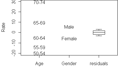
> fit <- aov(Rate ~ Age + Gender,x)
> model.tables(fit)
Tables of effects

 Age
  50-54   55-59   60-64   65-69   70-74
-19.870 -13.995  -5.045   9.480  29.430

 Gender
Female   Male
 -5.69   5.69
The estimated effects have zero mean over the dataset, as required.
effects.plot(fit)
effects.plot(fit,se=T)Instead of T, you can also specify a z value for the interval.
From the aov fit we can obtain a table of expected responses, by calling rtable on it:
> rtable(fit)
Rate
       Gender
Age     Female   Male
  50-54  5.360 16.740
  55-59 11.235 22.615
  60-64 20.185 31.565
  65-69 34.710 46.090
  70-74 54.660 66.040
This table is purely additive; if you make a profile plot you will see
perfectly parallel lines.
We can define residuals for the fit by taking the difference between the actual responses and the expected responses:
> e <- rtable(fit)
> y - e
Rate
       Gender
Age     Female   Male
  50-54  3.190 -3.190
  55-59  1.415 -1.415
  60-64 -0.385  0.385
  65-69 -1.710  1.710
  70-74 -2.510  2.510
A boxplot of these residuals is shown in the effects plot. The size of the
residuals lets you gauge how close the table is to being additive. If the
residuals are smaller than the effects, then we know that the table is
nearly additive. It also lets you know which of the predictors are
relevant: a predictor whose effects are about the same size as the
residuals is not a useful predictor.
Functions introduced in this lecture: