Classification of Cells by Gene Expression Profiling
The details of exactly how the information encoded in a genome is read, interpreted, and realized in a collection of cells cooperating to make up a multicellular organism is one of the most basic but subtly complex questions in biology. As cells divide during development beginning from a single zygote, they differentiate into different cell types, with increasingly distinctive signatures of gene expression. Identifying these types is especially challenging in the nervous system, where key components may be present in low numbers, their effects amplified by the neural circuits they're connected with. For that reason, research in this field often requires the data collection from multiple single cells, capturing the gene expression profile of each by reverse transcribing and counting the mRNA transcript sequences present.
A 2017 paper in the journal Cell from Hongjie Li, Felix Horns, et al., "Classifying Drosophila Olfactory Projection Neuron Subtypes by Single-Cell RNA Sequencing," uses this approach, as well as illustrating a variety of the computational techniques to analyzing these kinds of large data sets—in this case the expression levels of fifteen thousand genes across hundreds of individual neural cells. Since the authors have made the files from their analysis workflow available, the study is also a useful resource for applying machine learning and other big data analysis methods to real data sets.
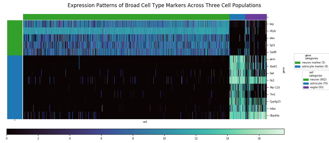
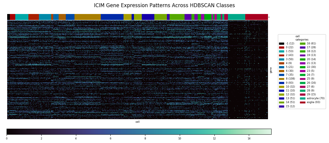
Heatmaps are the tool of choice for representing a very large table of values, by translating numerical values to colors. In the following figure the columns of data are the gene expression profiles of 1065 cells across fourteen gene markers. Specifically, the underyling number for each row within the column is the log2 of 1 plus the Counts Per Million for that particular gene in that particular cell sample. (Counts Per Million explained here as Transcripts Per Million.)
Heatmaps can also be combined with dendrograms created by agglomerative hierarchical clustering algorithms. These algorithms a major class of unsupervised machine learning methods for grouping data points (in this case cells) into classes based on their profiles of values across a set of variables (in this case expression levels for each gene). The basic idea of agglomerative clustering is to represent the data points in a space, choose a distance metric—Euclidean distances being the most common, but the Manhattan distance, Chebyshev distance, or a variety of other similarity metrics can usually work as well—and also choose an averaging method for calculating a single distance value between pairs of clusters each with multiple points. Then, starting with each point as a single cluster, iteratively build up clusters by finding the nearest pair, according to the chosen distane metric, of uncombined clusters and then forming a single cluster from them, repeating this process until all points are in a single cluster. The combination of choices of metric and average method results in a large variety of options.
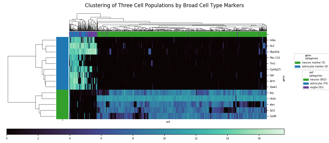
With distinct cell classes (neurons and astrocytes plus other glia. designated 'esglia') and gene markers specific to these classes, a clustering algorithm easily identifies the split between classes, but it can't completely resolve the astrocyte and eslgia populations into distinct clusters. There are also a few outliers from the latter population that end up mixed in with the neurons. With a relatively small number of markers, and with the markers having similar enough expression profiles that much of the information is redundant, there isn't enough data to do a better job at discrimination.
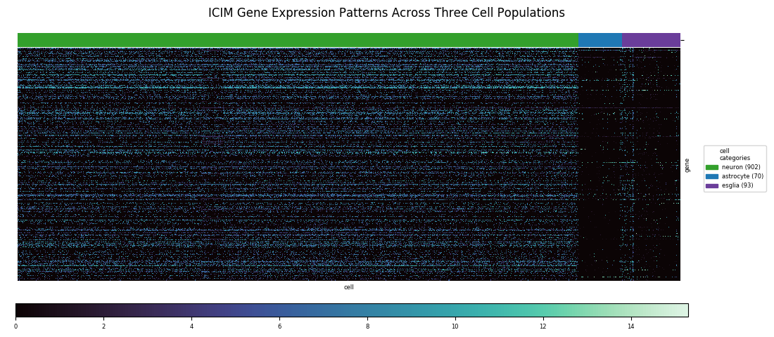
When the classes of interest are less distinct the relevant differences may be more subtle and involve a larger set of genes. The central focus of the paper was identifying subtypes of olfactory projection neurons. In the fly brain, olfactory receptors connect directly to these projection neurons, which carry the information to the brain; moreover, each type of projection neuron is known to connect specifically to one type of receptor. Therefore, these subtypes are a physical manifestation of how the fly brain encodes odors. To distinguish these subtpyes, a major part of the authors' analysis involved inventing a technique called Iterative Clustering for Identifying Markers, ICIM, which filters for the most informative genes across the fly genome for distinguishing subtypes among the cell population being considered. Using this method, 561 markers were identified for subtype discrimination.
Dimensional Reduction and HDBSCAN Results
To apply a distance-based hierarchical clustering approach to such a data set, a dimensionality reduction step is typically necessary. This is a consequence of the so-called 'curse of dimensionality,' the upshot being that it is much easier to find clusters if the data is represented in a lower-dimensional space. In terms of the last heatmap, each column of values can be thought of as a position vector for the cell in 'gene expression space' and since applying ICIM to this date set yielded 561 genes of interest, these vectors represent points in 561-dimensional space prior to reduction. One standard dimensionality reduction technique is t-distributed stochastic neighbor embedding, or t-SNE. The key things about t-SNE are that it's non-deterministic, so may give slightly results for repeated runs with the same input data, and that it preserves the structure of clusters in higher dimensional space while compressing to a lower dimensional space, typically with two dimensions.
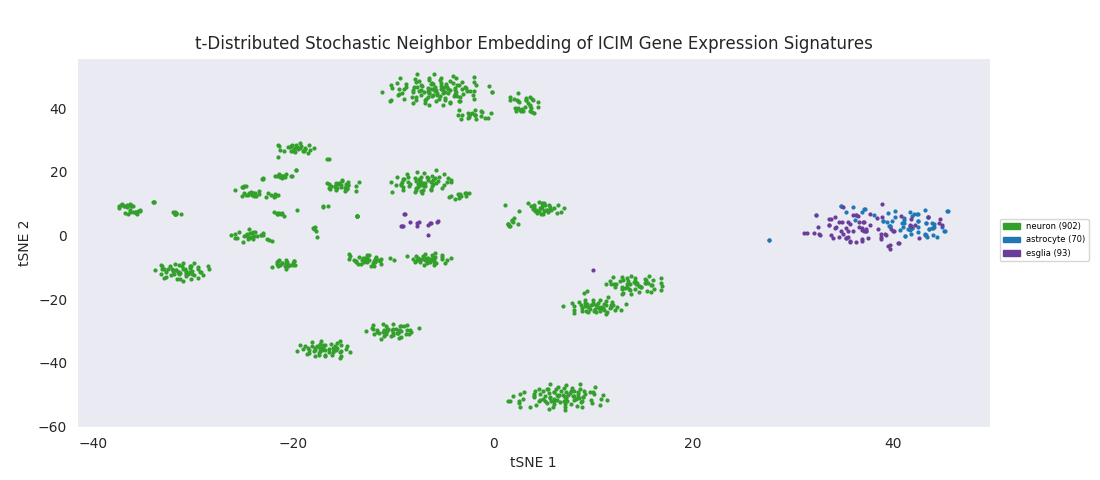
The t-SNE embedding of the ICIM-identified genes reveals a structured clustering in the data points that was in some sense present in higher dimensions, but only becomes sensible to human eyes when reduced to a couple dimensions. Clusters of neurons are all grouped in their own area of the embedding space. The astroctye and esglia data points are distinctly separate from that set of clusters, intertwined in their own single cluster rather than resolving into distinct groups. This is possibly because the esglia population contains a large fraction of astrocytes that were not explicitly labeled as such, but more likely because the 561 genes used for discrimination here were selected with only neurons in the cell population, so aren't optimized for discriminating subtypes of anything other than neurons. A few esglia outlier points are scattered among the neuron clusters. Unsurprisingly, the esglia that were mixed in with the neurons in the heatmap cluster are all in this lot.
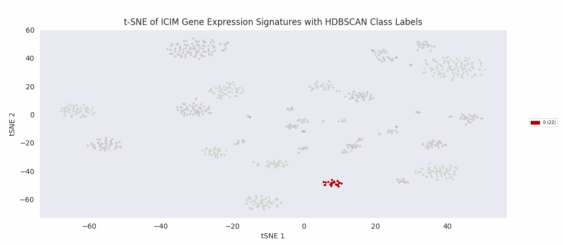
It's at this point, with the data reduced to two dimensions, that the authors applied an algorithm to find clusters corresponding to subypes of the olfactory projection neurons populating the region of tissue the sample was taken from. Specifically, they used HDBSCAN, a hierarchical extension of DBSCAN, Density Based Spatial Clustering of Applications with Noise, which in its basic form as a clustering algorithm does not yield hierarchy information. (Note that '-1' signifies uncategorized data points, which couldn't be assigned by the algorithm to a cluster.)
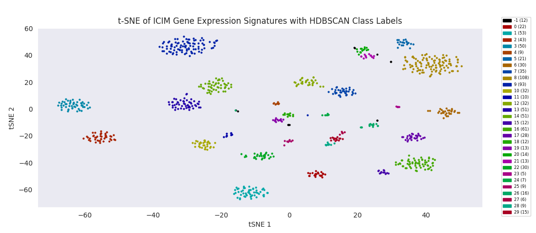
With the cells grouped by HDBSCAN label in the heatmap, discernible transitions in the expression pattern of the ICIM genes across category boundaries begin to become apparent.
Other Clustering Approaches
HDBSCAN is a relatively new method that doesn't yet seem to be as widely used as others, and there don't appear to be any good standard Python HDBSCAN methods. However it appears that the bulk of the analysis is done by the t-SNE embedding that naturally groups the data points into clusters in two-dimension space; once this dimensionality reduction is completed, identifying those clusters in the embedding should be able to be accomplished by a variety of methods.
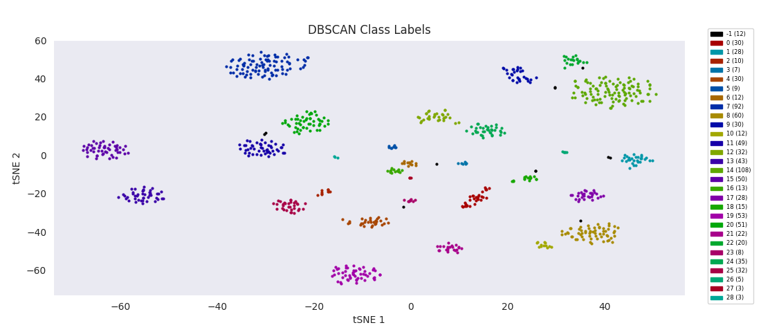
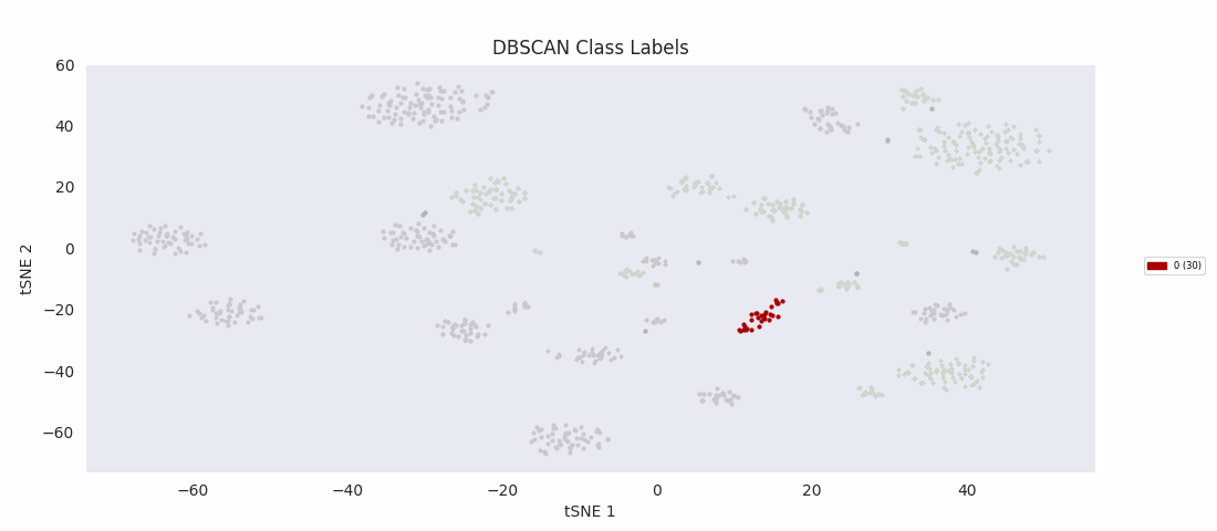
The basic DBSCAN algorithm, Density-Based Spatial Clustering of Applications with Noise, does nearly as well with the minimum cluster size and distance threshold tuned appropriately. These two parameters are used in the DBSCAN cluster finding procedure: a point is randomly chosen, and if there are more points than the minimum size within the threshold distance, it becomes the nucleus of a new cluster. The cluster is filled out by successive rounds of adding all points that are within the threshold distance of any point already in the cluster. If there aren't enough nearby points to nucleate a cluster, the point is instead labeled as 'noise' (unassigned). Then the process repeats with a random unassigned point until all points have been assigned to a cluster or deemed noise.
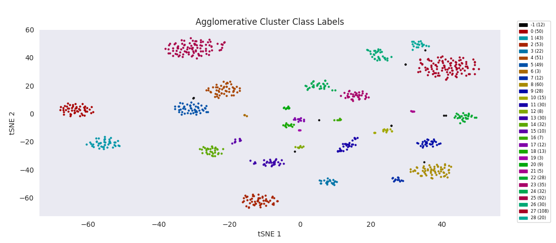
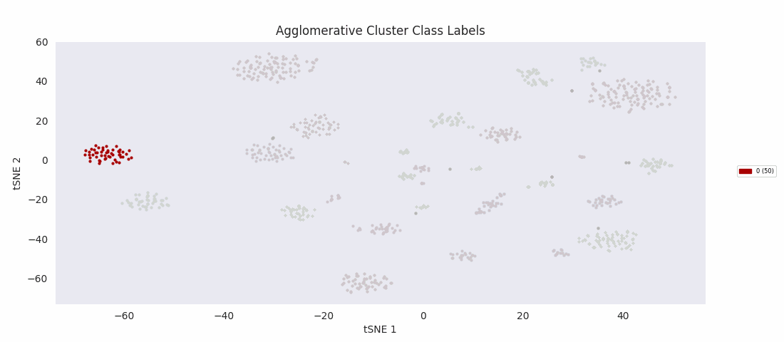
Applying the previously mentioned agglomerative clustering approach and cherry-picking the best parameters also works. The following cluster labeling was generated using the complete-linkage or 'complete' method with a Euclidean distance metric. During agglomerative clustering with the complete method, the distance between two clusters is defined as the largest distance between all possible pairs of points, one in each cluster.
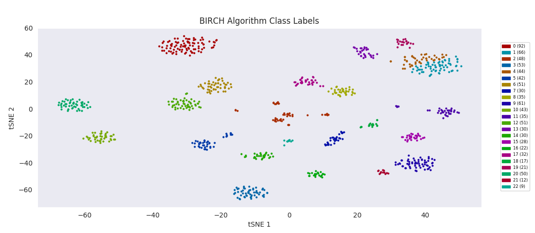
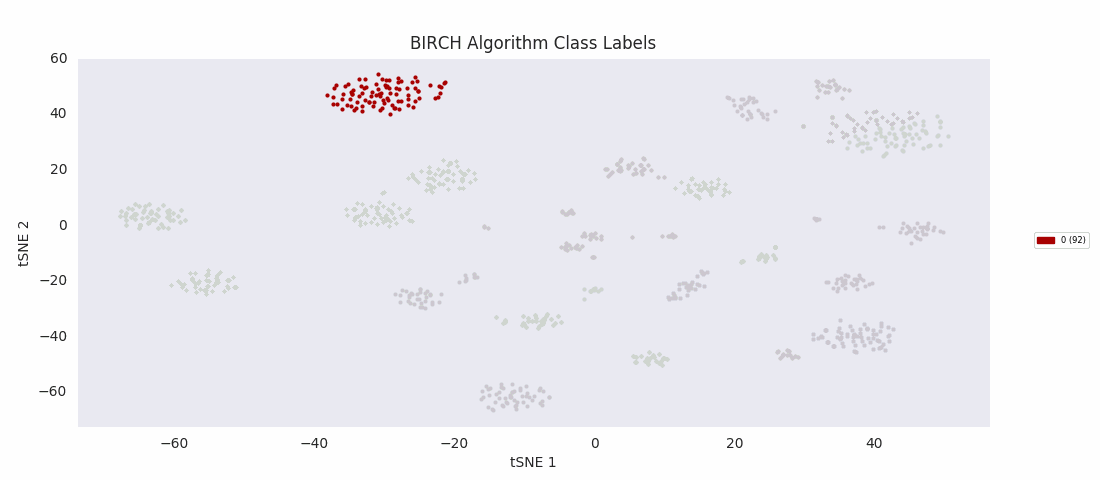
BIRCH, or balanced iterative reducing and clustering using hierarchies, is ultimately built on agglomerative clustering, but with intermediate steps to generate a 'CF tree' (clustering feature tree). The number of clusters to find is passed to the function as an input parameter. The advantage of the method is that clustering features can be used for more efficient calculation of cluster distances for much larger sets of data than the one at hand.
For this data set however, even choosing the cluster number that gives the most sensible category assignments, 23, BIRCH clustering doesn't work as well as DBSCAN or simple agglomerative clustering. In particular, Categories 1 and 4 make much more sense to be considered a single large cluster, while Category 2 appears to be really be at least four small clusters.
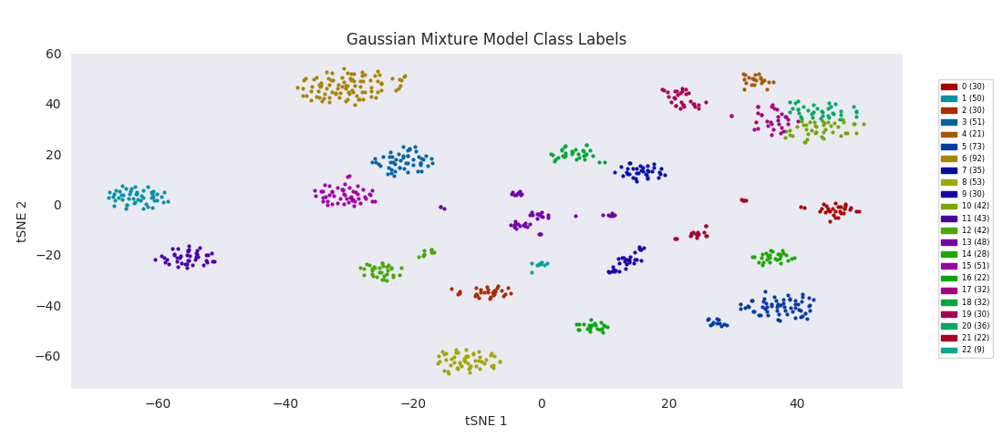
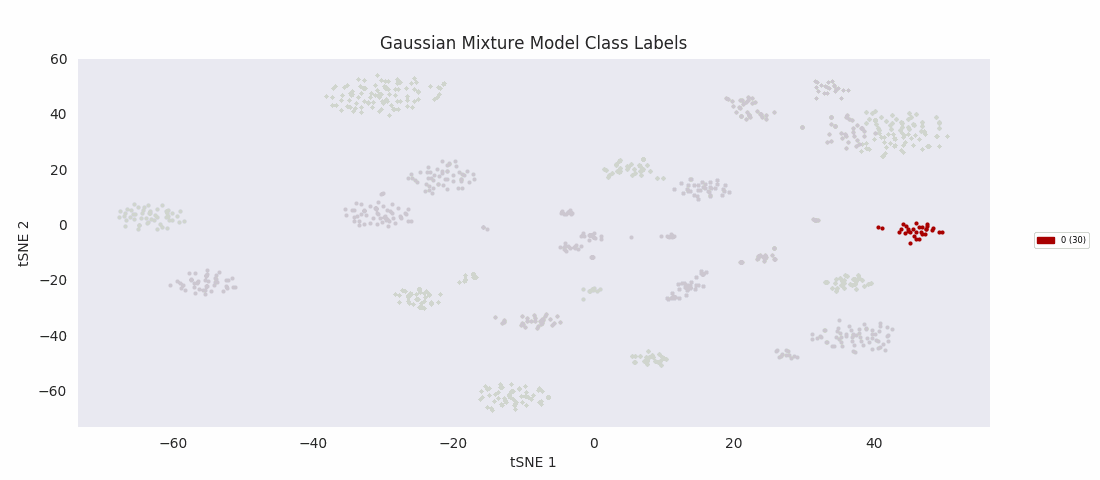
The Gaussian mixture modeling approach also has the number of clusters defined at the outset. It works by assuming each cluster can be modeled as a set of random points with a Gaussian distribution in two dimensions, and iteratively adjusts these distributions' parameters to fit them to the data points. After fitting, the closer to the center of the distribution a point is, the higher the probability of membership in the corresponding cluster.
Similarly to BIRCH, however, Gaussian mixture modeling begins to divide up large clusters without any apparently good enough reason at a lower number of total clusters than those found by HDBSCAN, DBSCAN or Agglomerative Clustering. On the other hand, the four or five small clusters in the center are once again lumped into a single category, labeled 13 this time. For both these last two algorithms, the difficulty appears to be handling clusters of widely variable sizes.
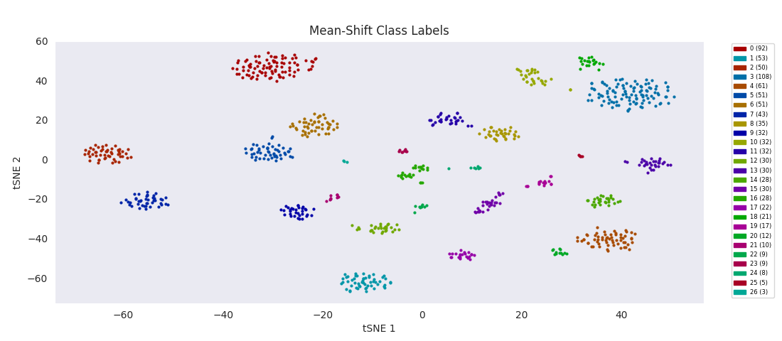
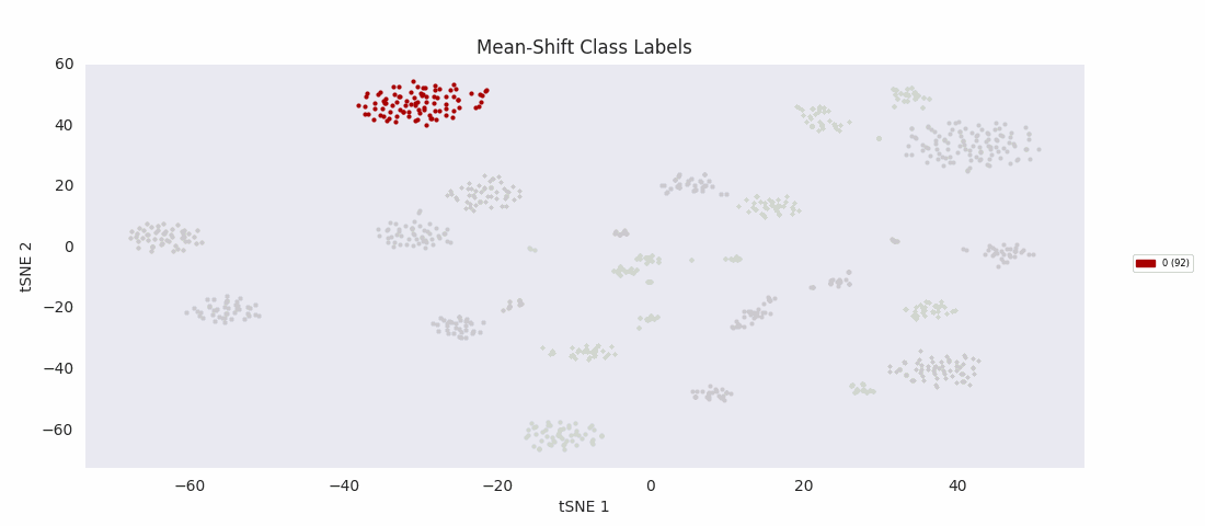
So, I decided to try an algorithm that was supposed to be good with a range of cluster sizes, mean-shift clustering. This method uses circular windows to find the centers of clusters of points. The windows are iteratively updated to shift in the direction of highest density until a local peak corresponding to a cluster center is found. With a window positioned over each cluster center, all points nearer to the center of one window than any other are assigned to the same class.
As expected, with the appropriate input 'bandwidth' parameter setting the size of the search window, mean-shift clustering does much better at distinguishing the variously sized clusters than the previous two methods, and more closely agrees with the results found by HDBSCAN, agglomerative clustering, or DBSCAN.
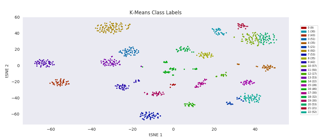
For the sake of completeness, I also tried applying the most basic clustering method, k-means clustering, which takes the number of clusters to find, k, as an input parameter. The algorithm initializes by randomly positioning a center point for each cluster. Data points are then classified according to which class center is nearest. The position of each class center is updated to be the mean position of the data points in the class, and the cycle repeats until the center positions reach a steady state. K-means turns out to do about as well as BIRCH or Gaussian mixture models, with the same issues apparently related to dealing with a range of cluster sizes.
The possibilities for automatated cluster identification are numerous and the best choice depends on the specifics of the data set. These examples will help begin to build an intuition for which methods are appropriate for any given problem.
Machine Learning Utility Library
In the course of visualizing these data sets, it turned out to be necessary to devote an entire side project to designing and developing a custom function for plotting heatmaps, with automatic legend generation and placement, and plot sizing and positioning. This will be a useful tool for a common data plotting method that I expect I'll want to use over and over. I have begun collecting such tools into a library file, from which they can be imported as needed.
I implemented tsne as an object, initiated with a data set that automatically calculates a t-stochastic neighbor embedding. Plotting is a method defined for the tsne object, leveraging some of the same techniques used for legend creation in the heatmap function, and including the same options of printing to a file or displaying with plt.show. Additionally, there is the option to pass a list of
I also needed to create a function to help apply agglomerative clustering in a manner consistent with the other clustering methods. The standard Python functions for cutting the dendrogram of an agglomerative clustering result to yield category labels allow for the choice of number of categories to find, but not for a minimum cluster size. So I wrote a function that, if necessary, increases the number of categories to find and repeats the dendrogram cutting process until the desired number of categories clearing the size threshold are found, or the number of categories can't be increased effectively anymore. Data points that were in a potential category not meeting the size threshold are instead considered to be unlabeled. This function and the tsne object as well as my custom heatmap function can all be found in the Python library at this link.
Links
Paper available through here (seventh publication listed for 2017). The online version of the paper also includes a github link for their analysis code, as well as a link to a genomics repository for the processed data files.
My code to make the plots for this page
Technical notes on the custom heatmap function I developed in the course of this project
Documentation comparing the clustering algorithms available in the scikit-learn library
This post includes good explanations of DBSCAN, agglomerative clustering, Gaussian mixture modeling, mean-shift clustering, and K-Means Clustering.
An invaluably informative post for getting a handle on best practices for working with hierarchical clustering in Python