Customizing the Interface for Seaborn Heatmaps
Background and initial motivation
The seaborn library for Python, being optimized for data visualization, is an indispensible tool for data science. In practice, it's an enhancement built on top of matplotlib, not a replacement: the plt.show and plt.savefig methods are still used for figure display, and matplotlib objects such as axes and legends work more or less the same way, which turned out to be important for the customizations I made. Nevertheless, as a rule I find it's almost always preferable to go through seaborn when creating figures, directly interacting with matplotlib only where necessary. Usefully, seaborn also complements pandas, since it's natural to use dataframes and their associated structures and methods to handle the underyling data.
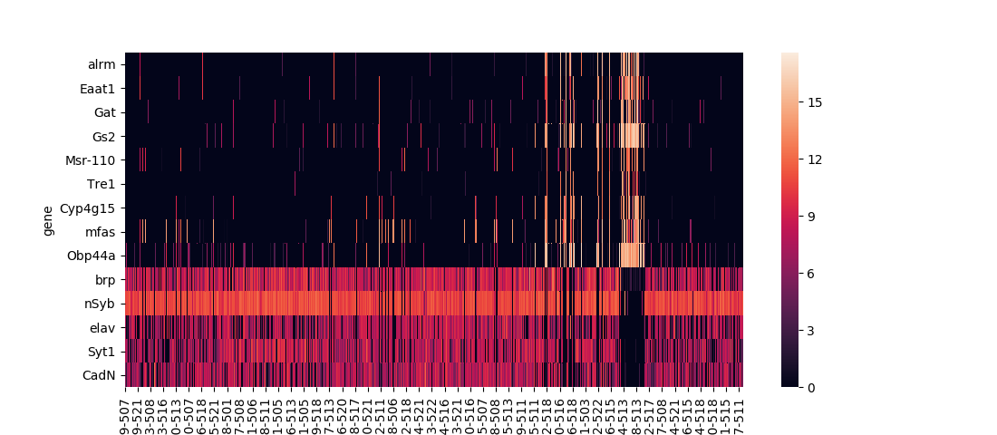
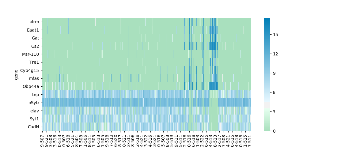
Seaborn has two built-in functions for plotting heatmaps, seaborn.heatmap and seaborn.clustermap. The former is the most basic option, straightforwardly plotting the input dataframe:
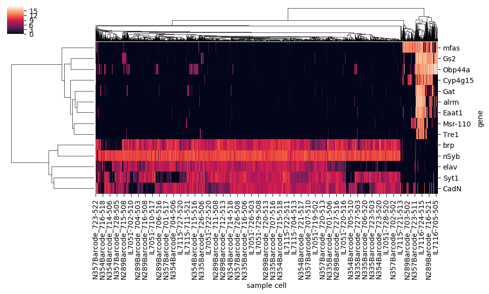
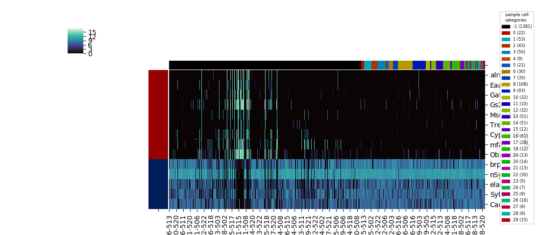
The latter uses a hierarchical clustering algorithm (or the results of a previously calculated hierarchical clustering) to construct a dendrogram for the dataframe's rows, columns, or both, and sorts the columns and/or rows to align with the displayed branches:
The data set I use in these examples is expression levels of selected genes in single fruit fly neural cells, calculated using RNAseq with the numbers for each gene denoting 1 + log2(CPM), CPM being the counts per million of that gene's mRNA transcript. Playing with different ways to analyze this data, provided as a supplementary resource for a 2017 paper in the journal Cell, was the project that convinced me to develop some custom functions for common data visualization methods.
I was motivated to wrap these functions into a single heatmap function for several reasons. First was imposing consistency and straightforwardness, since the built-in functions have a slightly different set of parameters, and have slightly different methods for saving the plotted figure. The basic heatmap, as seen above, plots like any typical plotting method onto a matplotlib axes that lives on a figure, and as with other typical plotting methods, the axes will likely not be in an ideal position on the figure canvas without some some manual altering of the figure parameters. The clustermap method is better behaved in this respect: the function returns a special ClusterGrid object, as well as automatically creating a figure and heatmap axes as attributes of the clustergrid. The clustergrid also includes the row and columns dendrograms and the new order of the rows and columns, as well as its own savefig method, which automatically does the job of fitting the heatmap, dendrogram, and text labels into the limits of the figure.
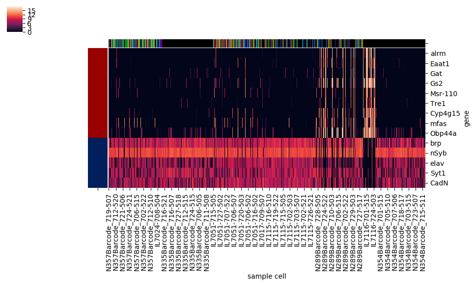
However, this method also automatically squeezes into a corner the colorbar showing the correspondence between colors and numerical values; there's no simple option for the more legible colorbar size and positioning used as a default in the basic heatmap. On the other hand, seaborn.clustermap has a capability that seabborn.heatmap lacks: adding a color code (independent of the color code for the main heatmap) to rows or columns based on a specified category assignment. Ideally, seaborn.clustermap could be used to display a heatmap without clustering but with category colors, simply by setting the options for row and column clustering to
This does work, but the positioning within the figure isn't optimal anymore. Although hierarchical clustering dendrograms were not created, axes were created for them on the figure, and the clustermap's savefig method allotted room for them, resulting in a lot of awkward whitespace.
Implementation details
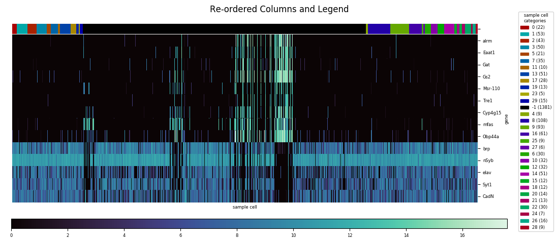
With automatic axis placement a sufficient reason to create a custom heatmap function, several other worthwhile customizations presented themselves as I went through the actual implementation process. First, if there's a kind of figure I expect to be generating over and over, I like to avoid having to repetitively include a line to either show or save the plot. So my function—called heatmap, even if it ironically ended up being built entirely around seaborn.clustermap and doesn't use seaborn.heatmap at all—includes a parameter to specify a destination location and name to automatically save the file. If no path is given, plt.show is automatically called instead. Similarly, I knew that for convenience I wanted to automate a consistent method for mapping categories to colors, and creating a legend for these mappings. In fact, determining category legend placement would have to precede axes placement, since the size of the necessary legend(s) would vary from data set to data set, and then determine how much room would be left for the actual plot and dendrogram(s).
To generate a category colormap for a row or column, heatmap first calculates the number of different categories. For twelve or fewer categories, each category is assigned a color from a standard sequence:
For a larger number of categories, heatmap instead generates a series of colors for each category using the seaborn.hls_palette function. This function outputs a series of points in HSL color space, with constant lightness and saturation values, and hue values equally spaced around the circumference of the cylinder:
For each axis, if the option to calculate a dendrogram is set to heatmap sorts the dataframe along that axis by category before display. Because of that possibility, the function is set up to always reorder the palette series by alternately picking from the first and second halves of the original palette. This maximizes contrast, since adjacent colors will now be roughly complementary, on opposite sides of the HSL cylinder:
Sequential and diverging colormaps
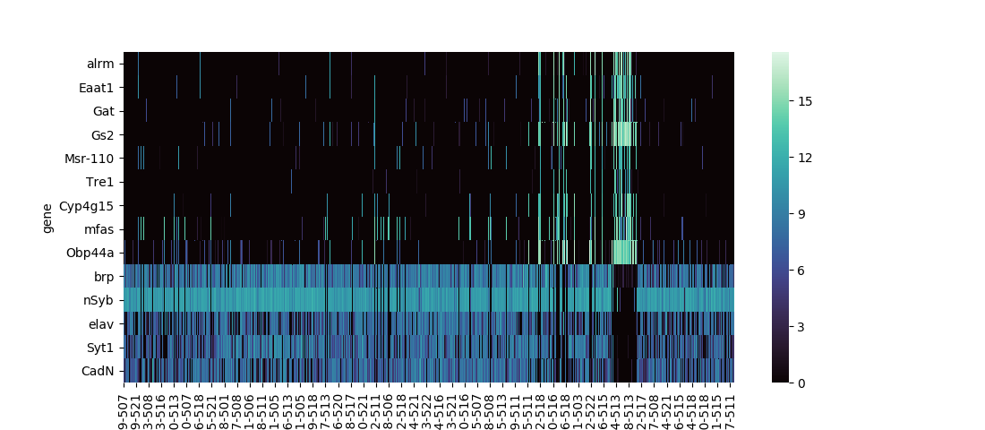
Before continuing with the details of legend creation and placement, let's make a brief detour to talk more about colormaps. For discrete data types such as categories it makes sense to use a map that maximizes contrast between the discrete colors. For continuous data, though, the appropriate thing is to choose from two other types, either a sequential colormap, or a diverging colormap. The default colormap for both seaborn.heatmap and seaborn.clustermap is 'rocket,' a sequential colormap included with seaborn. Sequential colormaps show a steady progression in lightness, either increasing or decreasing, corresponding to increasing data values. Typically, this lightness progression is matached with a continuous progression in hue between two anchor colors at the minimum and maximum data values, along with a continuous progression of saturation values. It was simple to add a few lines to heatmap to change the default colormap to 'mako,' another seaborn sequential map.
If instead of absolute numerical values, you're interested in deviations in either direction from a threshold value, a diverging colormap is used instead of a sequential. Values at or near the threshold present as pure white, desaturated of any color. Deviations in either direction are represented by increases in saturation of one of two distinct anchor hues. When a value for the optional seaborn.heatmap or seaborn.clustermap the default colormap changes to a diverging colormap, and heatmap replicates this behavior. Instead of a library colormap, I used the seaborn.divering_palette function to generate a custom diverging colormap based on green and blue anchor hues.
Other sequential and diverging colormap options are available through matplotlib. This link also lists categorical colormaps, including 'Paired,' from which I derived the palette I used for twelve or fewer categories by rearranging the order.
Legend and colorbar placement
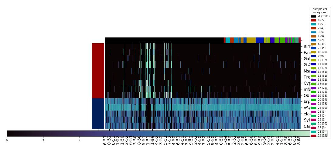
With the category colormap(s) generated, heatmap next creates a legend using the matplotlib.patches and proxy artist technique, with the midpoint of the legend's right edge anchored to the midpoint of the figure's right edge vertically, 0.01 figure units to the left of the figure's right edge horizontally. For each category, the legend also indicates that category's population. (Note that starting with this example, the images here were created using the savefig method of the figure, not the clustergrid, since the latter's automatic expansion of the visual window beyond the figure limits would partly undo and defeat the purpose of moving and resizing everything to nicely fit into the figure.)
Getting rid of the unsightly clustermap colorbar is straightforward: the axes object, an attribute of the clustergrid called cax, has a remove method to delete itself. Then, heatmap creates a new axes for a new colorbar, which is then created using the figure's built-in colorbar method. With the right side of the figure being occupied by the legend, seaborn.heatmap's default colorbar placement isn't the best anymore, so I chose to create a horizontally oriented colorbar across most of the bottom of the figure. The trickiest part was figuring out how to access the information on number and color correspondance that was automatically used to generate the seaborn.clustermap colorbar, and pass it to the manual colorbar method. This is stored in a so-called mappable object, which lives as the first and only element of a list called collections, an attribute of the heatmap axes attribute of the clustergrid, called ax_heatmap. With the legend and colorbar placed, and the heatmap's x and y axis tick labels resized to take up less space, the big task remaining was to make the necessary calculations to resize and shift the heatmap, including the dendrograms if they were generated, to fill the remaining space in the figure.
Re-aligning axes using their bounding boxes
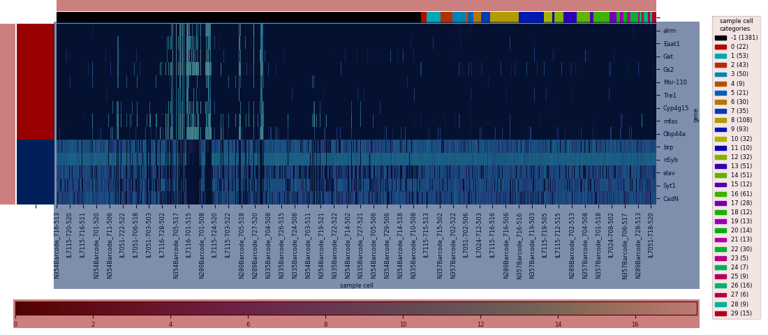
To manually control the placement of the figure's axes, I needed to access each of their bounding boxes using the get_tightbbox method. These bounding boxes encompass not just the axes, but the ticks, labels, etc. that decorate the axes, so in effect they define the space that each element will take up. However, the bounding boxes themselves aren't defined directly; this is determined automatically by a combination of the size of the axes itself and the additional space needed for the extra elements. So some amount of calculation would be needed to work backwards from the desired final results to get the necessary inputs.
Legends have their own bounding boxes, which can also be accessed via get_tightbbox, so with the legend size and placement determined, the first step was to calculate its width in figure units (i.e. fraction of the figure dimension). I've added 0.02 figure units of margin on the right side of the legend bounding box, and 0.03 units to the left side. The total width including margins then gets factored into the creation of the axes for the colorbar, which uses the figure's add_axes method. This method takes as arguments the (x,y) coordinates of the new axes's bottom left corner, its width, and its height, all in figure units. Since the space needed for the colorbar's ticks will be constant and predictable, three of the arguments will also be constant across every plot created, with the only variable being the width, shortened automatically to align the colorbar's right edge 0.03 figure units left of the legend's left edge.
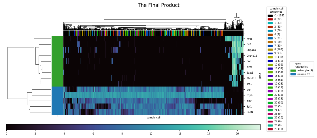
Fortunately, the axes for the main heatmap and the dendrogram are adjustable as a unit, using the figure's subplots_adjust method, just as if they had originally been generated as a grid of subplots. The arguments for adjustment directly define the left, right, bottom, and top edges of the subplots in figure units, excluding any extra space betweed the edges of the subplots and the edges of the bounding box. The get_window_extent method, called on each of the axes and the legend, extracts the numbers defining their visible extent, converting to figure units, and by the appropriate comparisons to the numbers from heatmap calculates the right edge input to subplots_adjust that will result in the right edge of the bounding box aligning with the right edge of the colorbar bounding box. The bottom edge of the bounding box is similarly aligned 0.03 figure units above the top edge of the colorbar bounding box.
Aligning the top and left edges is trickier, since it turns out the category color row and column fall outside the limits of the bounding box. However, the combined visible width of the column of row label colors and the heatmap proper will be a constant factor times the nominal width based on left and right edge values as provided to subplots_adjust. With this information it becomes possible to calculate the inputs that will results in the left edge of the row color labels to align with the left edge of the colorbar—if the row dendrogram were present, it would be the left edge of the dendrogram axes aligning with the left edge of the colorbar instead. Similar calculations are made for either the top edge of the row of column label colors or the top edge of the column dendrogram, aligning it either 0.03 figure units short of the top edge of the figure, or, if a figure title is present, 0.03 units short of the bottom edge of the title's extent.
Additional modifications
An additional modification I made was to add input parameters,
Finally, although the function by default doesn't return anything, I added a
In the final product, all of these calculations happen invisibly, and all manually entered parameters are included in a single call of heatmap in a single line. The dataframe is the only mandatory parameter, and the default, for both rows and columns, is not to cluster and compute dendrograms. Other parameters controlling the behavior include setting either the row and/or column cluster option to seaborn.heatmap and seaborn.clustermap are accepted as well, and passed straight to the underlying call of seaborn.clustermap. These include the parameters controlling figure size, the colormap, the
Links
More info on sequential, diverging, and categorical colormaps
