Day 35 - Multivariate geometry
In this course we started with one-dimensional data, then examined
relationships between two variables, and more recently tried to predict one
variable from many. Now let's consider the most general situation: finding
relationships between a large number of variables (many to many). In
statistics, this is called multivariate analysis.
Multivariate analysis is useful whether or not you have a designated
response variable. When there is a designated response, as in
classification and regression, multivariate analysis is useful for
diagnosing non-additive interactions. For example, we saw last week that
the geometrical shape of a dataset was crucial in choosing between logistic
regression and nearest-neighbor classification. When there is no
designated response, multivariate analysis is useful for finding trends,
anomalies from those trends, and clusters.
It helps to think about datasets in terms
of multivariate geometry.
Consider this data frame describing iris flowers:
Sepal.Length Sepal.Width Petal.Length Petal.Width    Species
         6.0         2.2          4.0         1.0 versicolor
         6.1         2.8          4.7         1.2 versicolor
         5.8         2.7          5.1         1.9  virginica
         6.8         2.8          4.8         1.4 versicolor
         7.7         3.8          6.7         2.2  virginica
Instead of viewing this as a table of predictors and responses, we can view
it as a set of points in high-dimensional space. Each row is a point with
four numeric dimensions and one categorical dimension.
For now, let's focus on the four numeric dimensions.
Each of the three species forms a cloud of points
in four-dimensional space, defined by the four measurements above.
What is four-dimensional space? It is a mathematical abstraction. You
take the Cartesian coordinate system that we are familiar with in 1d, 2d,
and 3d and extend it a the natural way. A point x is indexed
by four numbers: (x1,x2,x3,x4). The length or
norm of a point x is denoted
||x|| = sqrt(x1^2 + x2^2 + x3^2 + x4^2)
which is a straightforward generalization of the definition of length in
1d, 2d, and 3d. The distance between two points is the length of
their difference:
d(x,z) = ||x-z||
The main difficulty of four-dimensional space is visualizing it.
There are several ways to look into four dimensional space.
The technique we will use today is the same one used by photographers to
capture a three-dimensional world on two-dimensional film. We will
visualize high-dimensional data through projections.
Draftsman's display
The simplest kind of projection is when you drop all but two dimensions.
If you do this for all pairs of dimensions, you have what is called a
draftsman's display. In R, this is done with the function
pairs:
pairs(iris)

It is called a draftman's display since in 3D it corresponds to taking
pictures of an object from three canonical directions. For engineering,
this is a compact way to represent to three-dimensional structure of an
object. But if the object is high dimensional, it is all but impossible to
put these pictures together to form an idea of the object in our minds.
The draftsman's display is mainly used for determining the
correlation structure of the variables. In this case, we see that all of
the variables are correlated, especially Petal.Length and Petal.Width.
We can also see that the dataset is
clustered.
A lot of information is contained in this display, and we will examine it
further in a later lecture.
Grand tour
A more general kind of projection is when we take a picture of an object
from an arbitrary direction. The formula for a projection from
(x1,x2,x3) to (h1,h2) is
h1 = w1*x1 + w2*x2 + w3*x3
h2 = u1*x1 + u2*x2 + u3*x3
where the w's and u's are real numbers.
(Technically, we also want w and u to be orthogonal and unit length.)
In photography terms, this is an orthographic projection,
corresponding to a very large focal length. There are no perspective
distortions in such a projection.
The draftsman's display, when we just drop dimensions, corresponds to w =
(1,0,0), u = (0,1,0), or the like.
The formula for a projection from any number of dimensions down to one
dimension is
h1 = w1*x1 + w2*x2 + w3*x3 + w4*x4 + ...
In linear algebra, this is an inner product between w and x, denoted
w'x ("w transpose x").
To project down to more than one dimension, just combine multiple inner
products, giving the point (h1,h2,...).
The idea of a grand tour is to smoothly pan around an object,
viewing it from all directions, instead of only from a few canonical
directions. We can do this by smoothly varying the projection vectors
w and u. You can make a grand tour via the ggobi package, an optional extension to R.
Here are some snapshots of a grand tour of the iris data:
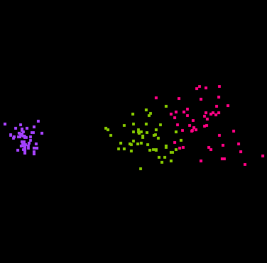
That's right, you are looking at four dimensional space! (Through a
two-dimensional window.)
The points have been colored according to the Species variable.
Some projections keep the classes separate, and some don't.
In some projections the three classes have the same shape, while in other
projections they do not.
The second image above shows that the classes are "flat", implying there
is a strong amount of linear redundancy among the four measurements.
Principal Components Analysis
The grand tour is informative, but time consuming, especially when there
are more than four variables to search over. Therefore it is useful to
automatically find informative projections. This is a question that
photographers often confront: what is the best perspective for viewing an
object? One answer to this is provided by principal components
analysis (PCA). Projections throw away information, namely the depth
of each point. A good projection should throw
away as little information as possible, i.e. the depths which have been
lost should have small variance. If there is a large variation in depth
among the points, then a great deal of information has been lost by
projection. PCA finds the projection with smallest variation in depth.
Interestingly, this criterion is equivalent to
making the projected points as
spread out as possible. Intuitively, PCA says that if you want to view
something thin, like a piece of paper, you should view it face-on, where
the depth is constant and the projection is spread out, rather than
edge-on, where the depth is spread out and the projection is small.
Mathematically, we can describe the "depth" information lost by projection
as the
distance between an original point x and its projection
Px. We can think of x and Px both being in high dimensional
space, except that Px lies on a plane (the "film").
The formula for "depth" is
d(x,Px) = ||x - Px||
The quality of a given projection vector w is the variance of the depth
over the dataset. PCA finds the w which minimizes this quantity.
Equivalently, PCA finds the w which maximizes the spread of the Px.
This process works when projecting down to one dimension, or any number of
dimensions.
The result is a projection that hopefully gives an informative look
at the data, without the need for a grand tour.
To get an idea of what we are missing in this projection, we can define an
R-squared statistic, analogous to the one for regression:
            variance( ||Px|| )
R-squared = ------------------
            variance( ||x|| )
R-squared is the percent of the variation which is captured by the
projection. The larger the R-squared, the more flat the object is.
To run PCA, use the function pca. For a one-dimensional
projection, it returns a projection vector. For a two-dimensional
projection, it returns a matrix of projection vectors. Here is the result
on the iris data (first four columns only):
> w <- pca(iris[1:4])
R-squared = 0.965303
> w
                     h1
Sepal.Length -0.7511082
Sepal.Width  -0.3800862
Petal.Length -0.5130089
Petal.Width  -0.1679075
> w <- pca(iris[1:4],2)
R-squared = 0.998372
> w
                     h1         h2
Sepal.Length -0.7511082 -0.2841749
Sepal.Width  -0.3800862 -0.5467445
Petal.Length -0.5130089  0.7086646
Petal.Width  -0.1679075  0.3436708
A 2D projection always captures more variation than a 1D projection, so its
R-squared is higher. In this case, a 2D projection captures virtually all
of the variation in the dataset.
To apply a projection matrix to a data frame,
use the command project:
> project(iris,w)
       h1        h2 Species
-5.912747 -2.302033  setosa
-5.572482 -1.971826  setosa
-5.446977 -2.095206  setosa
-5.436459 -1.870382  setosa
-5.875645 -2.328290  setosa
...
Each row of this frame is a two-dimensional point,
plus the Species variable which was left unchanged.
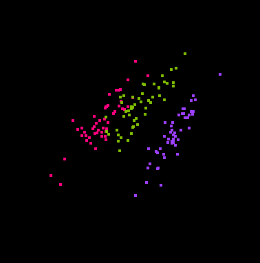
Here is what the projection looks like:
cplot(project(iris,w))
Because most of the variation in this dataset is due to the variation
between classes, the classes are separated by the PCA projection.
However, this isn't always the case. If the classes have a lot of
variation within themselves, e.g. due to irrelevant dimensions, then the
PCA projection will focus on that and will not separate the classes.
Consequently PCA makes the most sense when there is no designated response
variable and we just want to understand the shape of the point cloud.
Discriminative projection
When there is a designated response, as in the iris dataset, it makes sense
to consider an alternative projection principle: a good projection
should preserve our ability to predict the response.
For classification, this means that the classes should remain separated
and not be projected on top of each other. PCA does not ensure this.
"Class separation" is tricky to define mathematically. One approach is to
define it as the distance between the class means. The mean of a class is
the center of its point cloud; the coordinates are the mean along each
dimension. Suppose we have two classes and the means after projection are
Pm1 and Pm2. Then we would want to maximize
||Pm1 - Pm2||.
This doesn't quite work, since the spread of the classes may differ in
different projections. Assuming the classes have the same spread, we
divide the distance between means by the projected standard deviation:
||Pm1 - Pm2||/sqrt(PVP').
This has the effect of standardizing the variables so
that the choice of units doesn't matter (similar to what we did for nearest
neighbor on day33).
The projection which maximizes this criterion is called the
Fisher projection.
You can compute the Fisher projection of a dataset via the
projection function, with type="m".
It assumes that the last variable in the data frame is the response,
which is true for iris since Species is last.
Otherwise it is the same as using pca:
> w <- projection(iris,2,type="m")
> w
h1 h2
Sepal.Length -0.0741 0.0204
Sepal.Width -0.4135 0.0128
Petal.Length 0.3334 -0.3998
Petal.Width 0.8440 0.9163
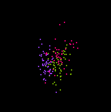
> cplot(project(iris,w))
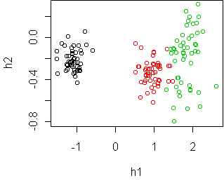
This projection separates the classes quite well. The first
dimension, h1, is all you need. The second dimension gives some
additional information, namely that the
virginica species (in green) has largest spread, and might even
be composed of two separate sub-groups.
Projection based on spread
The distance between means is not always the best way to define class
separation. For example, if one class is contained within another, then
what is important is the difference in spread, not the difference in mean.
Consequently, projection also supports two other options:
type="v", which maximizes the difference in spread, and
type="mv", which compromises between "m" and
"v".
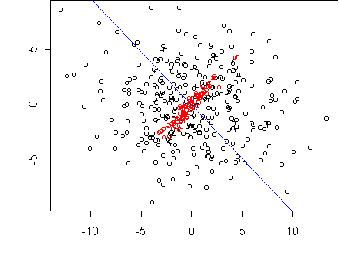
Here is a simple example where one class is contained in another.
The dataset is two dimensional, and we want to reduce it to one dimension.
The projection line which maximizes the difference in spread is shown in
blue.
Here is another dataset, where one class has been shifted. Now we
compromise between maximizing the difference in class mean and class
spread.

Handwritten digit recognition
To illustrate the use of these
projections, let's return to the digit recognition
problem from day34.
Here is PCA:
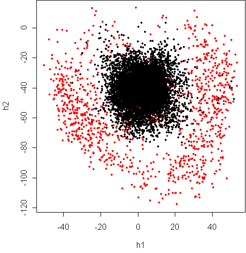
> w <- pca(x8[,1:16],2)
R-squared = 0.83
> cplot(project(x8,w))
The red points are "8" and black are "not 8".
The "not 8" class is evidently composed of different clusters,
probably corresponding to the different "not 8" digits.
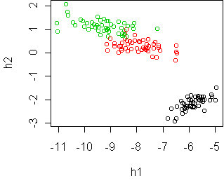
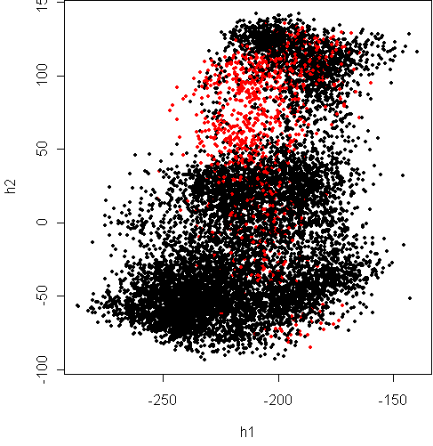
Here is Fisher projection:
> w <- projection(x8,2,type="m")
> cplot(project(x8,w))
It would seem that the classes have significant overlap, at the top of the
plot. What about separating based on spread?
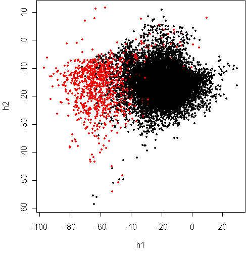
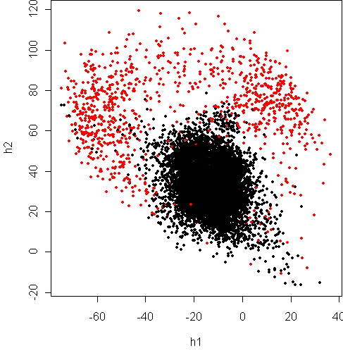
> w <- projection(x8,2,type="v")
> cplot(project(x8,w))
This shows that the variance of digit "8" along some dimensions is much
higher than the other digits combined. It lends weight to the argument
from day34 that the boundary between the classes is
closer to quadratic than linear.
How can we reconcile this picture with the one above?
As shown in lecture, it turns out that the black class is slightly
deeper than the red class, so that if you look sideways you get the above plot.
We can get a projection in between these two by
separating based on means and spread:
> w <- projection(x8,2,type="mv")
> cplot(project(x8,w))
This projection again shows that
the boundary is quadratic. The Fisher projection is only
a sideways look at what is really going on.
Code
To use the projection functions, download and source the appropriate file:
multi.r
multi.s
Functions introduced in this lecture:
- pairs
- pca
- project
- projection
Tom Minka
Last modified: Thu Jan 17 20:24:22 EST 2002