n <- 100
x1 <- runif(n)
x2 <- runif(n)
y <- x1 + x2 + x1*x2
predict.plot(y~x1+x2)
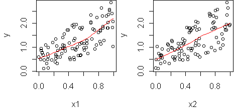
fit <- lm(y~x1+x2)
predict.plot(fit)
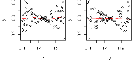
predict.plot(fit,partial=T)
y = a + b1*x1 + b2*x2 + b12*x1*x2Typically one uses bilinear terms since bilinearity is a common type of interaction and other types of interaction often have a bilinear component. In R, you add bilinear terms to a linear model via the ":" notation:
> fit2 <- lm(y ~ x1 + x2 + x1:x2)
> fit2
Coefficients:
(Intercept)            x1           x2           x1:x2
          0            1            1            1
> summary(fit2)
Coefficients:
              Estimate Std. Error    t value Pr(>|t|)
(Intercept) -4.441e-16  1.536e-16 -2.890e+00  0.00476 **
x1           1.000e+00  2.782e-16  3.595e+15  < 2e-16 ***
x2           1.000e+00  2.670e-16  3.746e+15  < 2e-16 ***
x1:x2        1.000e+00  4.724e-16  2.117e+15  < 2e-16 ***
The coefficient on the bilinear term is 1, which matches how we constructed
the data. The summary says that the bilinear term is statistically
significant, so we have detected an interaction.
To visualize the interaction and see if it is bilinear or not, we use a profile plot, just like last week. The difference is that here the predictors are numerical so we need to abstract one of them into bins. predict.plot will do this for you if you use the conditional notation "|":
predict.plot(y ~ x1 | x2)
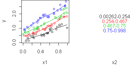
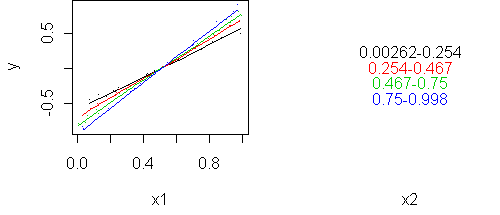
predict.plot(y ~ x1 | x2, partial=fit)
In this example, the predictors interact even though they are uncorrelated with each other. Correlation and interaction are separate things. Correlation is a property of two random variables while interaction is a property of three (two predictors and a response).
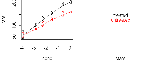
  conc rate   state
1 0.02   76 treated
2 0.02   47 treated
3 0.06   97 treated
4 0.06  107 treated
5 0.11  123 treated
...
We want to know how rate depends on the other two variables. Start with a predict.plot:
predict.plot(rate~.,Puromycin)
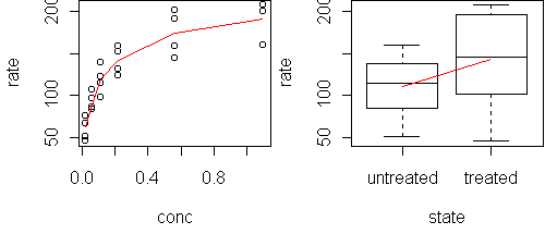
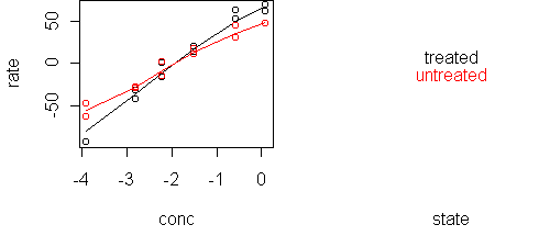
x <- Puromycin
x$conc <- log(x$conc)
predict.plot(rate~.,x)
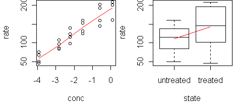
fit <- lm(rate~.,x)
predict.plot(fit)
predict.plot(fit,partial=T)
The model fits the predictors well (plots not shown). Now try adding interaction terms:
> fit2 <- step.up(fit)
> summary(fit2)

Coefficients:
                    Estimate Std. Error t value Pr(>|t|)
(Intercept)          209.194      4.453  46.974  < 2e-16 ***
conc                  37.110      1.968  18.858 9.24e-14 ***
stateuntreated       -44.606      6.811  -6.549 2.85e-06 ***
conc:stateuntreated  -10.128      2.937  -3.448  0.00269 **
step.up has added an interaction term, and it is significant.
Now plot it:
predict.plot(rate~conc|state,x)
predict.plot(rate~conc|state,x,partial=fit)
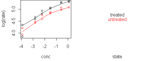
A likely scenario is that treatment multiplies the rate, which means that conc and state are additive in predicting log(rate). We can verify this with a single plot:
predict.plot(log(rate)~conc|state,x)
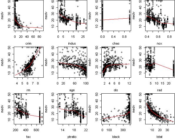
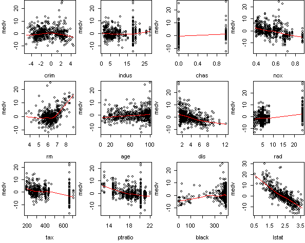
fit <- lm(medv~.,x)
predict.plot(fit,partial=T)
> fit2 <- step(fit)
Step:  AIC= 1492.58
 medv ~ chas + nox + rm + age + dis + rad + tax + ptratio + black +
    lstat

          Df Sum of Sq     RSS     AIC
<none>                  9254.2  1492.6
- age      1      73.1  9327.3  1494.6
- chas     1     167.7  9421.9  1499.7
- tax      1     190.3  9444.5  1500.9
- black    1     255.5  9509.6  1504.4
- rad      1     291.6  9545.8  1506.3
- nox      1     390.8  9645.0  1511.5
- rm       1     784.2 10038.3  1531.7
- dis      1     798.6 10052.7  1532.5
- ptratio  1    1209.3 10463.5  1552.7
- lstat    1    4915.8 14169.9  1706.2
The other variables, according to summary, have nonzero effect.
But in many cases this effect is small. Take a look at the sum of squares
listing from step. The four variables
(rm,dis,ptratio,lstat) are much more important than the rest.
Let's look for interactions only among these variables:
> fit2 <- lm(medv~lstat+rm+dis+ptratio,x)
> fit3 <- step.up(fit2)
> summary(fit3)
Coefficients:
                  Estimate Std. Error t value Pr(>|t|)
(Intercept)      -227.5485    49.2363  -4.622 4.87e-06 ***
lstat              50.8553    20.3184   2.503 0.012639 *
rm                 38.1245     7.0987   5.371 1.21e-07 ***
dis               -16.8163     2.9174  -5.764 1.45e-08 ***
ptratio            14.9592     2.5847   5.788 1.27e-08 ***
lstat:rm           -6.8143     3.1209  -2.183 0.029475 *
lstat:dis           4.8736     1.3940   3.496 0.000514 ***
lstat:ptratio      -3.3209     1.0345  -3.210 0.001412 **
rm:dis              2.0295     0.4435   4.576 5.99e-06 ***
rm:ptratio         -1.9911     0.3757  -5.299 1.76e-07 ***
lstat:rm:dis       -0.5216     0.2242  -2.327 0.020364 *
lstat:rm:ptratio    0.3368     0.1588   2.121 0.034423 *
Many statistically significant interactions are found.
Some of these we already know.
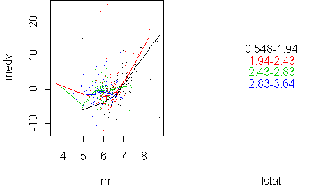
predict.plot(medv~rm|lstat,x,pch=".",partial=fit)
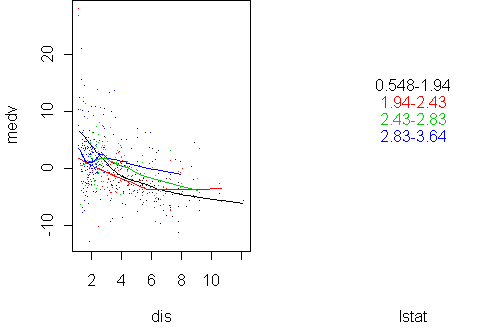
predict.plot(medv~dis|lstat,x,pch=".",partial=fit2)
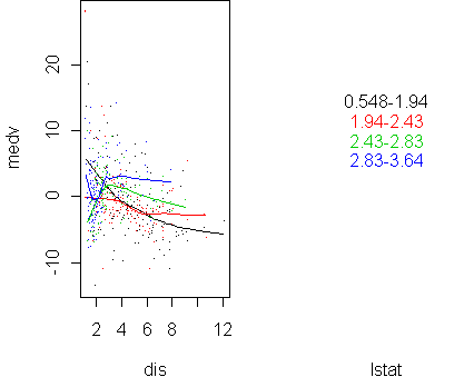
predict.plot(medv~dis|lstat,x,pch=".",partial=fit)