Day 11 - More applications of abstraction
Today we discussed three more applications of abstraction.
Interactive museum table
The first was an interactive museum exhibit. The exhibit lets you take a
virtual tour of architecturally interesting buildings. The views are quite
realistic, despite the fact that these buildings don't exist. See the
web page describing
the Presentation Table project.
The exhibit is controlled by an ordinary red disk on an ordinary table. A
camera watches the table from above and figures out where the disk is. The
tracking of the disk is done purely based on color with simple statistical
methods. First, a training set is collected by cropping the disk out of a
few images. All of the disk pixels are put into a batch, representing a
sample from the "disk pixel population". Each pixel has three numbers
which describe its color. The three numbers are the amounts of each
primary color: red, green, and blue. Therefore the pixel population is
a distribution in three-dimensional space.
Given a new image, we want to classify the pixels as "disk" or "not disk".
We can do this for each pixel by computing the probability that the pixel
arises from the disk pixel population. If the distribution is represented
by a histogram over colors, then we would just find the bin that the new
pixel falls into and look up the probability for that bin.
If the probability is high enough, the pixel is classified as "disk".
The abstraction problem here is what binning to use for the histogram. We
could evenly divide red, green, and blue into 4 bins, giving 4*4*4 = 64
bins total. This is what was done in the tiger/flower example. But it
won't necessarily give good results here. We need to maximize our ability
to discriminate the colors on the disk from those that are not. Too few
bins will make it hard to discriminate. But too many bins will make our
estimate of the population probabilities very noisy. For example, some of
the bins may be empty, even though the population probability is non-zero.
The appropriate abstraction principle here is the "beyond" principle. We
want to treat the training data as one group and compare future data to it,
as a whole. Another way to see it is that we want the probability
histogram to be as accurate as possible and reflect the major distinctions
in the color probabilities, while smoothing over noise. We can implement
this principle by merging color bins with similar density. Because it is a
three-dimensional histogram, we cannot use the bhist.merge function, but
the basic algorithm would be the same.
The actual system took a different approach. Instead of smoothing the
histogram by merging, the population probabilities were assumed to follow a
normal distribution (actually a tri-variate normal distribution). This
strong assumption eliminates the empty bin problem and makes it very easy
to compute the probability of a new pixel, since no table needs to be
stored. However, since the population is unlikely to be truly normal, the
discrimination is probably not quite as good as a histogram.
Time series change-points
A time series is a set of measurements which are ordered in time. Many
time series have the property that they have roughly the same value for a
period of time, then switch to another value, then switch again.
A natural question for this kind of time series is "where did the changes
occur?" This is called change-point analysis.
In fact, change-point analysis is just a clustering problem. We can apply
the methods we have already learned, almost without modification. Suppose
we divide the time series into time ranges R1, R2, etc. Within each range,
the time series has a mean value. The sum-of-squares about this mean value
is the scatter of the region. The sum of the region scatters measures the
quality of the division into regions. A division with lower sum-of-squares
is more likely to correspond to the true change-points.
The find the best division of the time series, we can start by making each
point is own region. Then merge regions which are adjacent in time so that the
sum-of-squares is minimum. This is exactly the same as Ward's method,
except for the time-adjacency constraint. k-means works, too.
Below is a plot of the water level of lake Huron each year from 1875-1972.
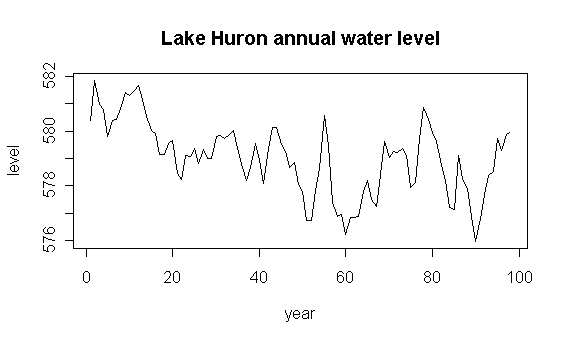
The time series has lots of structure, but it is difficult to see it from
this plot.
Here is the result of running Ward's method to get two regions:
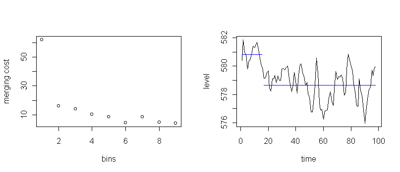
It appears that a major change happened after the first 16 years.
The blue lines are the average water level in each region.
The merging trace suggests six regions is also interesting.
Here is the result of stopping Ward's method at six regions:
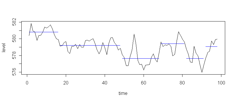
This plot suggests that the water level after the first 16 years
has been oscillating between two different values, with variable amounts
of time between changes. There also seems to be a mini-oscillation on top of
this one.
Here is the R code to make these plots:
source("clus1.r")
library(ts)
data(LakeHuron)
x <- as.numeric(LakeHuron)
plot(x,type="l",main="Lake Huron annual water level",xlab="year",ylab="level")
break.chpt(x,2)
break.chpt(x,6)
Regression with many interacting predictors
Clustering can also be used to simplify regression problems. For example,
suppose we want to predict the price of a house based on various attributes
like number of rooms, distance to employment, and neighborhood type.
These predictors interact, e.g. the number of rooms might not be as
important if the neighborhood has lots of crime.
We don't expect a simple linear regression approach to work.
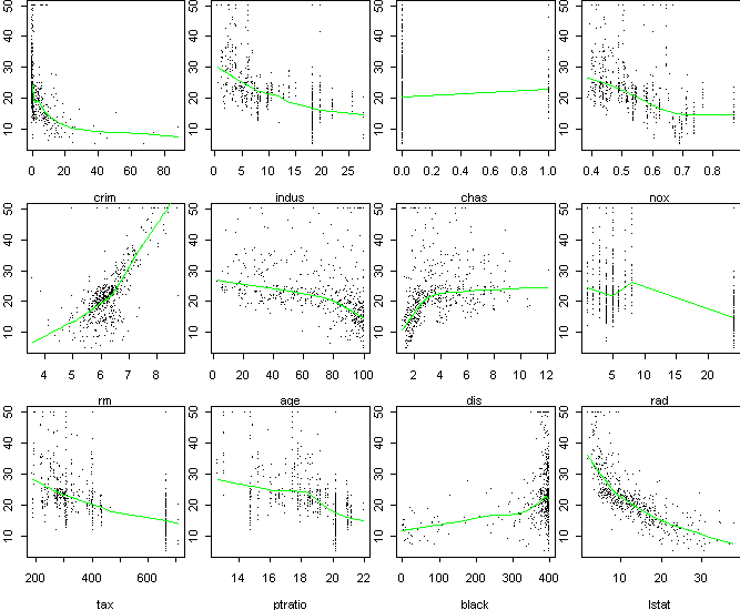
The figure below shows a scatterplot of price versus each of 12 predictor
variables in a dataset of house prices in Boston. Each data point is an
aggregate over several houses in a small area. These plots are useful for
determining which predictors are relevant. The green line shows the
overall trend. A trend upward or downward means a variable is relevant to
price. Apparently, most of the predictors are relevant, at least in
specific regions. However, these scatter plots don't show how the
variables interact in predicting price.
By clustering the response variable, price in this case, we can divide the
data into simpler sub-populations. We can then analyze the detailed
behavior within the sub-populations, or make gross comparisons between the
sub-populations. The appropriate principle in this case is the within
principle. Below is a histogram of the price variable along with the
breaks found by k-means:
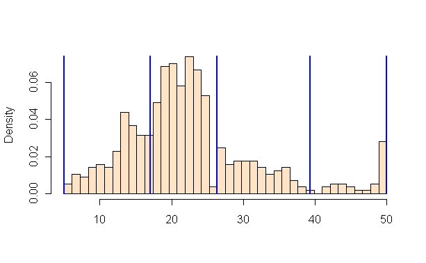
The breaks seem pretty reasonable.
However, there is something strange about this histogram. The last bin
is unusually large. In fact, 16 of the data points have price exactly
equal to "50", corresponding to $50,000. Most likely, the
actual prices are greater, but simply rounded down to 50.
Therefore we might want to split off this bin into a separate cluster.
To get an idea of how the predictors interact, we can make a scatterplot
two of them, coloring the points according to which price bin they fall
into. Effectively, we see three variables in the same plot.
Here is "number of rooms" versus "lower-income status":
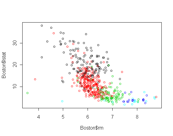
The price categories, from lowest to highest, are colored black, red,
green, dark blue, and light blue.
There is clearly
a relationship between the lower-income status and the number of rooms, but
that is of secondary interest.
The important aspect is that the main difference between the lowest
priced homes and the rest is lower-income status, while the main difference
among the higher-priced homes is the number of rooms.
In fact, if you look back at the plots of rm vs. price and
lstat vs. price, both have a change in slope at price 20
(halfway through the red class), with
rm becoming more important for higher priced homes.
Tom Minka
Last modified: Wed Sep 26 13:52:11 Eastern Daylight Time 2001