When predictors are categorical, one can predict the response by simply averaging the responses observed in the training data. For numerical predictors, this is not possible since the predictor value we get in the future may not precisely match any value we have seen in the past. Right from the beginning, we need to impose constraints on how the predictors are related to the response.
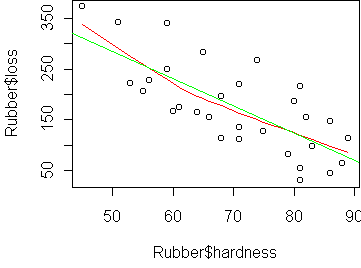
Consider this dataset
that comes from testing of tire rubber:
  loss hardness tensile
1  372       45     162
2  206       55     233
3  175       61     232
4  154       66     231
5  136       71     231
...
We want to predict loss (the abrasion loss in gm/hr) from hardness. The basic visualization tool here is the scatterplot:
plot(Rubber$hardness, Rubber$loss)

plot(Rubber$hardness, Rubber$loss)
panel.smooth(Rubber$hardness, Rubber$loss)

Because the plot/panel.smooth combination is so common, and because data is usually stored in a frame, I am providing a function predict.plot which makes things simpler. To generate the above plot, you can just say
predict.plot(loss~hardness,Rubber)
To fit a linear model, we use the function lm, which is similar to aov. The resulting object gives you the coefficients (a,b). You can plot the line determined by (a,b) via the function abline. The line gets added to an existing plot. You can say abline(a,b) or abline(fit) which takes the coefficients out of an lm fit.
> fit <- lm(loss~hardness,Rubber)
> fit

Call:
lm(formula = loss ~ hardness, data = Rubber)

Coefficients:
(Intercept)     hardness
    550.415       -5.337

> abline(fit)
Consider this dataset describing various earthquakes in California:
    event mag station  dist accel
1       1 7.0     117  12.0 0.359
2       2 7.4    1083 148.0 0.014
3       2 7.4    1095  42.0 0.196
4       2 7.4     283  85.0 0.135
5       2 7.4     135 107.0 0.062
...
We want to model the relationship between accel (peak
acceleration towards the station) from dist (distance from
station). A scatterplot of these variables makes linearity quite unlikely:
data(attenu)
predict.plot(accel~dist,attenu)
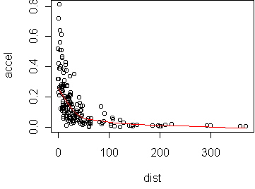
The transformations we will consider are the power transformations introduced on day2. There is a simple rule, the bulge rule, for determining which powers to use. If the curve bulges downward, then you should consider a power smaller than 1. If the curve bulges upward, then you should consider a power larger than 1. The bulge direction may be different for x than for y.
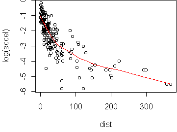
In this case, the curve bulges significantly downward in x and y. We can try taking the logarithm (p=0) in y:
predict.plot(log(accel)~dist,attenu)
predict.plot(-1/sqrt(accel)~dist,attenu)
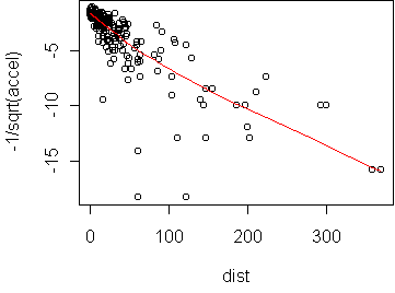
In this case, we should transform both x and y. We might have seen this immediately from the fact that the data is bunched up for low values of x as well as y. Transformation should generally be used to even out the distribution as well as produce linearity. For this data, raising to the 1/4 power works well: (we have to use I() for transforming a predictor)
predict.plot(accel^(1/4) ~ I(dist^(1/4)), attenu)
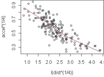
> fit <- lm(accel^(1/4) ~ I(dist^(1/4)), attenu)
> fit

Call:
lm(formula = accel^(1/4) ~ I(dist^(1/4)), data = attenu)

Coefficients:
  (Intercept)  I(dist^(1/4))
       1.0066        -0.1899
In the original variables, this fit means that accel^(1/4) = 1 -
0.19*dist^(1/4), or equivalently accel = (1 -
0.19*dist^(1/4))^4. This is surprisingly simple considering what the
original scatterplot looked like. Note that this model can only be
expected
to apply for the
range of distances appearing in the training set.
Obviously, when the distance is large we expect the acceleration to go to zero
and not increase again (as this model predicts it would).
             variance of predicted values
R-squared = ------------------------------
               variance of actual values
The transformation which achieves higher R-squared is better.
The command summary(fit) gives various information about the
fit, including R-squared. For the p=1/4 transformation, the R-squared is
0.67, while p=-1/2 has R-squared 0.59. Note that this is different from
using the average squared error of the predictions.
When we transform the predictor, we change the units of error, while
R-squared is dimensionless.
Another approach to check the quality of the fit is via diagnostic plots. The command plot(fit) will show four different plots:
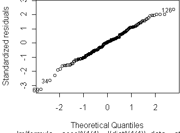
The fourth plot, Cook's distances, is used not so much to check the assumptions but to identify points which might have undue influence on the fit. These are not the same as outliers, since an outlier at the center of the data may have little effect on the fit. Influence is properly seen as the combination of large residual and large leverage. Residual is the distance of the response from the prediction. Leverage is the distance of the predictor value from the mean predictor value on the training set. Think of the line as a see-saw. Points with high leverage exert the greatest torque on the see-saw. Cook's distance quantifies influence by the amount which the regression coefficients change when a given point is left out of the training set. For the p=-1/2 transformation, there are a few points with much higher influence than the rest; they are dominating the fit. For the p=1/4 transformation, no points have unusual influence.
Note that all of the assessments above are on the data used to train the model. To get an unbiased estimate of how well the model will work on future data, we have to use other methods like the holdout method. If we have a learning parameter, such as the transformation power p, we could use cross-validation to automatically determine the best value. Basically, the situation is the same as performance assessment in classification (day22).
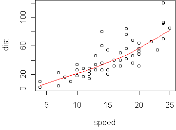
  speed dist
1     4    2
2     4   10
3     7    4
4     7   22
5     8   16
...
We want to predict dist (in feet) from speed (mph). A scatterplot shows the relationship is nearly linear:
data(cars)
predict.plot(dist ~ speed, cars)
predict.plot(sqrt(dist) ~ speed, cars)
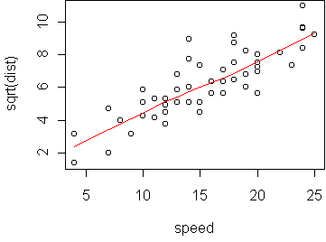
> lm(sqrt(dist) ~ speed, cars)

Call:
lm(formula = sqrt(dist) ~ speed, data = cars)

Coefficients:
(Intercept)        speed
     1.2771       0.3224
In the original variables, we find that dist = (1.3 + 0.3*speed)^2.
From kinetic energy considerations alone, we should expect that
stopping distance depends on the square of speed. (But simply squaring speed
does not work here.)
Functions introduced in this lecture: