Day 26 - Using additive models
Last time we introduced what an additive model was and how to fit one to a
response table. Today we give some examples of analyzing data with
additive models and discuss some of the finer points.
Transformation
Last time we analyzed a response table of Virginia death rates:
Rate
       Gender
Age     Female  Male
  50-54   8.55 13.55
  55-59  12.65 21.20
  60-64  19.80 31.95
  65-69  33.00 47.80
  70-74  52.15 68.55
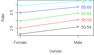
The conclusion from profile plots was that the table is nearly additive,
except that the Gender effect gets larger with Age. But there is something
suspicious about that conclusion. Looking at the table, we see that the
Gender effect for Ages 70-74 is (68.55-52.15 = 16.4) while the Gender
effect for Ages 50-54 is (13.55-8.55 = 5). This seems to support the
conclusion. But does it make sense to compare differences of rates?
As discussed on day14, rate differences can be
misleading. It is better to compare them using ratios. For Ages 70-74,
the risk ratio for Males to Females is (68.55/52.15 = 1.3) and for Ages
50-54 it is (13.55/8.55 = 1.6). So according to risk ratio, the Gender
effect decreases with Age. An additive model does not make sense on rates.
However, an additive model does make sense on log-rates, because a
difference of log-rates is equivalent to taking a ratio.
So we should have begun by taking the logarithm of the original response
table:
> z <- log(y)
> z
Rate
       Gender
Age       Female     Male
  50-54 2.145931 2.606387
  55-59 2.537657 3.054001
  60-64 2.985682 3.464172
  65-69 3.496508 3.867026
  70-74 3.954124 4.227563
Here are the profiles:
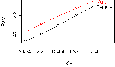
Interestingly, the table is more additive after taking the logarithm.
Before, the Age effect increased rapidly with Age. Now all Age profiles
are equally spaced.
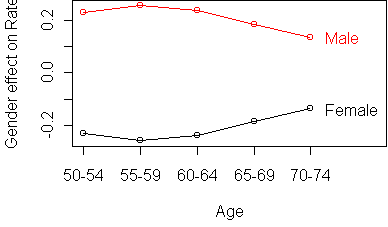
And the Gender effect decreases with Age instead of increasing.
The moral of the story is that you may need to transform your data before
an additive model makes sense. This wasn't a big issue when we were doing
trees, since trees only try to stratify the dataset when
there are different responses. Now transformation is an issue.
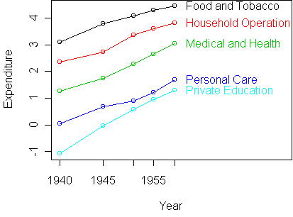
US Personal Expeditures
As another example, consider this table of US personal expenditures over the
years 1940-1960 (in billions of dollars):
Expenditure
                     Year
Segment                 1940   1945  1950 1955  1960
  Food and Tobacco    22.200 44.500 59.60 73.2 86.80
  Household Operation 10.500 15.500 29.00 36.5 46.20
  Medical and Health   3.530  5.760  9.71 14.0 21.10
  Personal Care        1.040  1.980  2.45  3.4  5.40
  Private Education    0.341  0.974  1.80  2.6  3.64
(Use dget("Expenditure.dat") to read the table into R.)
A profile plot shows that the predictors are not very additive:
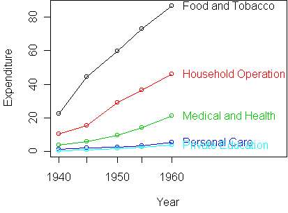
However, the curves seem to be growing in a particular way. In fact,
we might be inclined to say that expenditures grow exponentially from year
to year. If this is the case, then an additive model would make much more
sense on the logarithmic scale.
z <- log(y)
profile.plot(z)
This is clearly more additive.
In nontechnical terms, we would say that the growth rate in
expenditure over time is the same for all segments.
Equivalently, we could say that the ratio of expenditure between segments
is the same over time.
To get a better look at the deviations from
additivity, we standardize the plot:
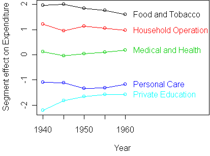
On a standardized plot, the rows of an additive table should be horizontal.
The biggest deviation from additivity is the expenditure on Private
Education in 1940. The expenditure on Food and Tobacco in
1960 also seems low. To get a quantitative idea of the size of these
deviations, we make an additive fit and look at the residuals.
Since we don't have the original data frame, we run aov directly
on the response table:
> fit <- aov.rtable(z)
> e <- rtable(fit)
> res <- z-e
> res
Expenditure
                     Year
Segment                 1940   1945   1950    1955   1960
  Food and Tobacco     0.131  0.173  0.012 -0.0820 -0.235
  Household Operation  0.153 -0.111  0.062 -0.0078 -0.095
  Medical and Health   0.046 -0.118 -0.049  0.0172  0.104
  Personal Care        0.113  0.103 -0.137 -0.1091  0.030
  Private Education   -0.443 -0.047  0.113  0.1817  0.195

> sort.cells(res)
               Segment Year Expenditure
5    Private Education 1940     -0.4431
21    Food and Tobacco 1960     -0.2346
14       Personal Care 1950     -0.1374
          ...
The function sort.cells that we used for contingency tables is
also useful here.
Car prices
Here is an example of how additive modeling is useful when analyzing a
complex data set with many variables.
The idea is to remove dominant effects via a tree and then find pairs of
predictors which seem to have large second-order effects.
We use the car price data from day20:
Cars93 <- read.table("Cars93.dat")
# remove dominant effects via tree
tr <- tree(Price~Horsepower+Weight,Cars93)
x <- Cars93
x$Price <- residuals(tr)

fit <- aov(Price ~ AirBags + Type + Origin, x)
effects.plot(fit)
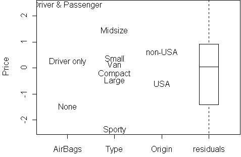
It seems that AirBags and Type have the largest
effect. Having lots of AirBags obviously increases the Price, and so does
being an import (non-USA).
Let's look at AirBags and Origin in more detail
for predicting Price:
y <- rtable(Price ~ AirBags + Origin, x)
profile.plot(y)
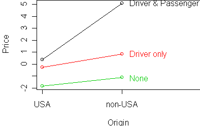
These variables are almost additive, except for the case of Driver &
Passenger AirBags, where non-USA cars are unusually expensive (or USA
cars are unusually cheap).
Insurance claims
Our final example is a table with dramatic deviations from additivity.
The dataset records the number of insurance claims made by car owners in 1973:
  District  Group   Age Holders Claims
1        1    <1l   <25     197     38
2        1    <1l 25-29     264     35
3        1    <1l 30-35     246     20
4        1    <1l   >35    1680    156
5        1 1-1.5l   <25     284     63
...
Here Group means the size of the car's engine, and
Age is the age of the policy holder.
We want to model claim rate, which is the ratio of the number of claims to
the number of holders. We compute that from the ratio of two response tables:
> claims <- rtable(Claims ~ Age + Group, Insurance, sum)
> holders <- rtable(Holders ~ Age + Group, Insurance, sum)
> y <- claims/holders
> y
Claims
       Group
Age       <1l 1-1.5l 1.5-2l  >2l
  <25   0.199   0.20   0.19 0.26
  25-29 0.138   0.16   0.21 0.25
  30-35 0.106   0.13   0.20 0.20
  >35   0.097   0.12   0.14 0.18
Notice the extra argument sum given to rtable.
This makes each cell of the rtable equal to the total as opposed
to the mean. Here are the raw and standardized profile plots:
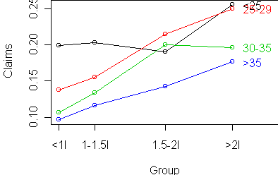
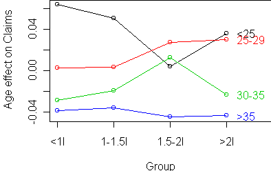
Interestingly, there is an increasing claim rate (risk) with engine size,
and it does seem to be additive with the risk from age.
The striking feature is what happens with 1.5-2l cars.
Age<25 has a dramatically lower risk,
while Age 30-35
has dramatically higher risk for those cars.
Code
Functions introduced in this lecture:
Tom Minka
Last modified: Tue Nov 06 18:59:06 Eastern Standard Time 2001