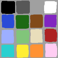


Assignment: Design a palette of 16 colors. Take into consideration a variety of tasks: search, sort, legibility, reproduction, and expressiveness. Rationalize your choice.

In order to maximize the use of the color palette for classification, I started by selecting the colors "by name" using the eleven colors that Boynton says are almost never confused: black, gray, white, red, blue, green, yellow, orange, brown, purple, and pink. To these, I added another gray (giving four achromatic colors). The remaining four colors I selected (still only by name) as follows:
When it came to actually assigning colors to names, I attempted to minimize saturation differences between colors. Hue is well sampled, at roughly eight points, and lightness has five values (the two extremes are achromatic.) The colors are grouped as follows
It is impossible to obtain a saturated light blue, therefore it and
light green form their own little group.
A listing of the color palette is available.
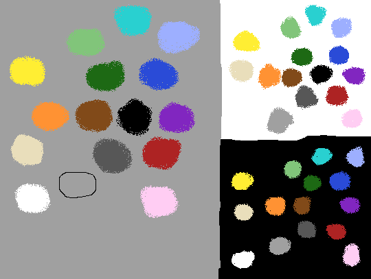
This palette has a large diversity in hue. Since hue is the
color property most useful for searching, it seems likely that this
palette will be good for searching. A few of the worst case examples
(each showing either a slight hue or value difference) are shown here:
Sorting, on the other hand, is best done with differences in
value. This palette provides limited opportunities for sorting.
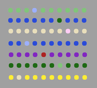
The value groups listed above provide
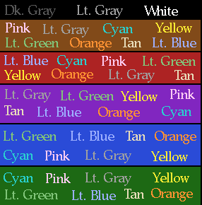
roughly 63 combinations of text and background (assuming light text on
dark background) that should be easily legible. Here are some
examples:
The chosen palette should perform well with real images. In
particular, special attention to skin tones is provided by two highly
desatured colors (pink and tan) which provide good skin tone rendition
for lighter skin, while darker skin tones are handled well by a brown.
Here's a test image (Card) shown
using the above palette. In both it and the 16 color images below,
Photoshop's error diffusion algorithm was used.
For comparison, here are:
This color palette is capable of expressiveness, as shown by the
following color pairs:
By constant value
The value of the lower group was arbitrarily set.
Light blue determined the value of it's group of colors. Yellow, tan
and pink all "wanted" to be brighter.
By constant saturation
Search and Sort
Legibility
Reproduction in Print
The colors were adjusted to provide good results when printing (yellow
was moved to a higher brightness, and cyan was reduced in brightness).
The colors with very low saturation (pink and tan) don't reproduce well.
Reproduction of Real Images
Expressiveness
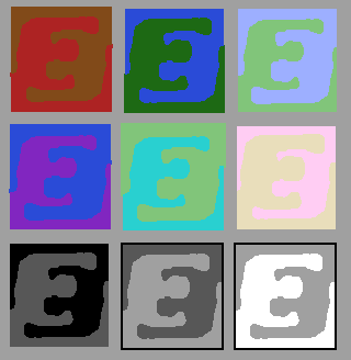
Raucous Colors

Some Quiet Color Pairs
These color pairs generally differ only in hue, and are analogous colors.
Loud Color Pairs

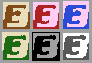
Finally, Strong Color Pairs
These color pairs generally differ only in value and saturation.
References


wad@media.mit.edu 10/96