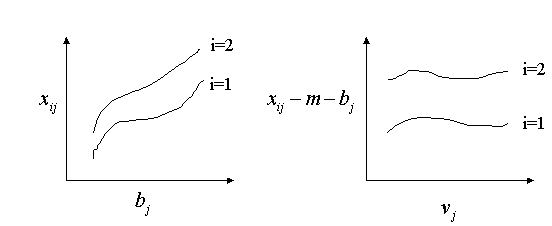
This surface looks curved, but if you look at any slice along x or along y, the function is linear. Because of the properties of multiplication, the sign is the same in opposite corners.
Additivity says that the difference between two rows is the same in all columns, and vice versa. The rows are parallel. Bilinearity says that the difference between two rows is linear in the column, and vice versa. The rows are converging or diverging lines. Additivity is a special case of bilinearity, when the slope is zero. To get bilinearity, we add a multiplicative term to our model. Instead of xij = m + ai + bj, we will have
xij = m + ai + bj + ui*vjEach row and column now has two effects: an additive effect and a multiplicative effect. The additive effects are (ai,bj), and the multiplicative effects are (ui,vj). To see that this agrees with the above notion of bilinearity, take the difference between two rows i and k:
(m + ai + bj + ui*vj) - (m + ak + bj + uk*vj) = (ai-ak) + (ui-uk)*vjThis is a linear function of the column effect vj. Note that bilinearity is a useful extension only on tables that are large enough for "linear" to mean something. In particular, the table must have more than two rows and more than two columns.
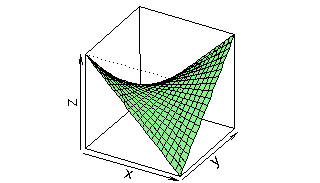
Bilinearity has a characteristic crossing pattern, as shown in the
following plot of z = x*y:
This surface looks curved, but if you look at any slice along x or along y,
the function is linear.
Because of the properties of multiplication, the sign is the same in
opposite corners.
In some statistics programs, they will use the notation A*B to represent a non-additive interaction term between A and B. Unfortunately, this is a misleading notation, because it doesn't refer to a bilinear or multiplicative term, but the full table of additive residuals.
response
    Var2
Var1      1    2     3     4     5   6
   1 -0.042 1.46  0.76 -0.58  1.26 1.7
   2 -0.300 1.53  0.30 -2.25 -0.21 1.1
   3 -0.920 0.57 -0.11 -1.40  0.43 0.8
   4  0.728 1.80  1.80  2.07  3.65 2.8
   5 -0.776 0.28  0.31  0.66  2.22 1.4
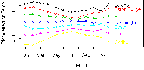
A raw profile plot shows that it is non-additive: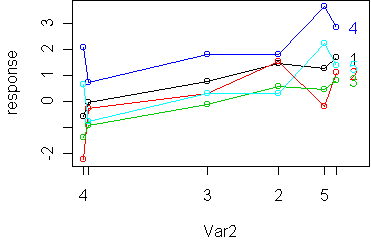
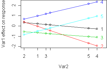
Mathematically, here is what is shown on a raw vs. standardized profile
plot:
rij = xij - m - ai - bj
minimize sum_ij (rij - ui*vj)^2
This problem is known as matrix factorization: representing a matrix as the product of simpler matrices, in this case vectors. The algorithm to do this is called singular value decomposition or SVD. It is built into R so one function call to svd gives us the ui and vj. We will see more applications of matrix factorization later in the course.
Temp
     Place
Month Laredo Baton.Rouge Atlanta Washington Boston Portland Caribou
  Jan   57.6        52.4    44.6       36.2   31.3     20.7     8.7
  Feb   61.9        55.6    46.7       37.1   29.2     21.5     9.8
  Mar   68.4        60.3    52.7       45.3   37.6     31.9    21.6
  Apr   75.9        66.8    61.7       54.4   47.2     41.9    34.7
  May   81.2        73.6    70.0       63.9   57.8     52.3    48.5
  Jun   85.8        79.6    77.7       73.4   67.2     61.8    58.4
  Jul   87.7        81.1    79.5       77.3   72.2     67.8    64.0
  Aug   87.8        80.7    78.6       75.4   71.5     66.4    61.8
  Sep   83.5        77.5    74.4       69.6   64.3     58.4    53.2
  Oct   76.5        69.6    63.4       58.2   55.0     48.4    42.1
  Nov   59.3        58.4    51.2       47.0   43.7     36.6    28.5
  Dec   59.5        53.6    45.2       38.0   32.8     24.9    14.6
A profile plot (with months ordered) shows a rise in the summer
and fall in the winter: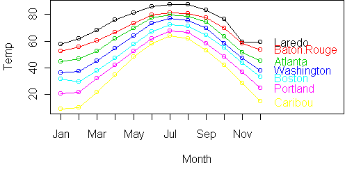
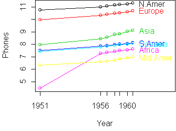
Phones
Year
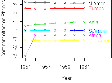
Continent 1951 1956 1957 1958 1959 1960 1961
N.Amer 45939 60423 64721 68484 71799 76036 79831
Europe 21574 29990 32510 35218 37598 40341 43173
Asia 2876 4708 5230 6662 6856 8220 9053
S.Amer 1815 2568 2695 2845 3000 3145 3338
Oceania 1646 2366 2526 2691 2868 3054 3224
Africa 895 1411 1546 1663 1769 1905 2005
Mid.Amer 555 733 773 836 911 1008 1076
Based on our previous experience with modeling expenditures over time, we
will start by taking the logarithm of the table. Here is the resulting
standardized profile plot: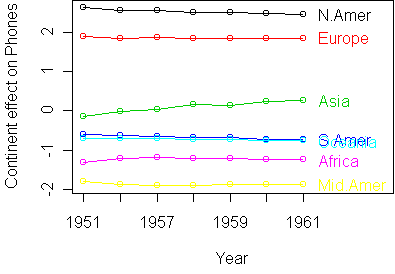
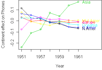
To zoom in on the deviations from additivity, we take residuals:
fit <- aov.rtable(z)
res <- z - rtable(fit)
profile.plot(res,standard=T)
phones(cnt,yr) = exp(m + a(cnt) + b(yr) + u(cnt)*v(yr))The ratio of phones in two years yr1 and yr2 is therefore
phones(cnt,yr2)/phones(cnt,yr1) =
   exp(b(yr2)-b(yr1))*exp(u(cnt)*(v(yr2)-v(yr1)))
In the above profile plot, v(yr) is position of yr on the x-axis. So v(yr2)-v(yr1) is the span in years. For a one year span, we get
phones(cnt,yr2)/phones(cnt,yr1) =
   exp(b(yr2)-b(yr1))*exp(u(cnt))
If we call exp(b(yr2)-b(yr1)) the worldwide growth rate, then exp(u(cnt)) is a growth rate modifier for continent cnt. In the plot, u(cnt) is the slope of the line for continent cnt.
So the interpretation of bilinearity is that different continents, Asia especially, scale the worldwide growth rate by a fixed amount. So if the worldwide growth rate is 5% in one year, Asia would scale this by 1.1, to get 5.5%. It is not simply a matter of each country having a separate fixed growth rate.
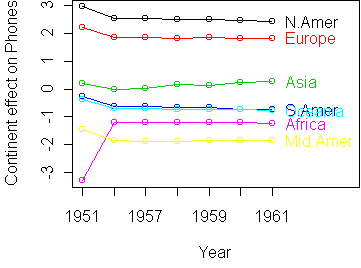
A simple solution to the outlier problem is to standardize by median instead of mean. You can tell profile.plot to do this by saying med=T:
profile.plot(z,standard=T,med=T)