Here is an example two-way contingency table. It reports the number of
passengers on the Titanic who survived and did not survive, classified by
age group:
       Survived
Age       No Yes
  Child   52  57
  Adult 1438 654
In this course, we go deeper than that and try to describe the nature of the relationship between the variables. In order to do that, we will apply tools like visualization, sorting, and clustering.
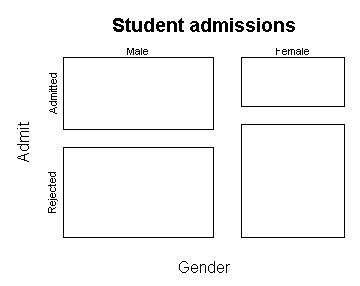
Here is the mosaic plot of the Titanic table and its transpose:
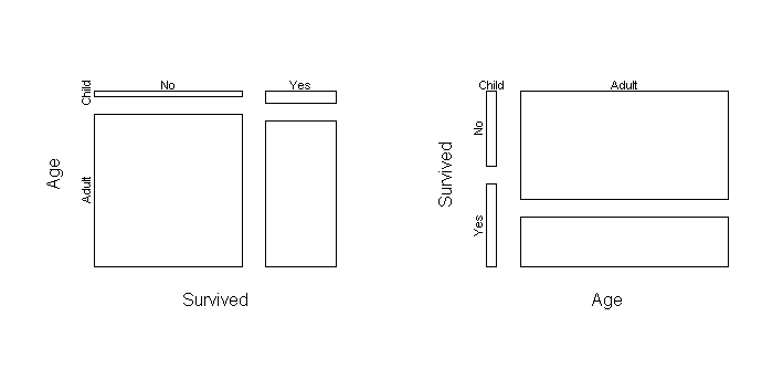
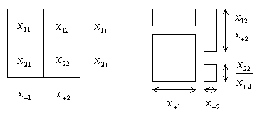
On the left plot, the height of the upper left box is the probability that
someone who did not survive would be a child: p(age = child | survived
= no). The width is p(survived = no).
On the right plot, the height of the upper left box is the
probability that a child would not be a survivor: p(survived = no |
age = child). The width is p(age = child).
The area of these two boxes is exactly the same, but they tell us different
things.
The plot on the left tells us that most of the people who survived (and did
not survive) were
adults, though the survivors have a greater proportion of children.
The plot on the right tells us that children had a greater probability of
survival than adults. It also tells us that the number of children who
survived is approximately equal to the number which did not, a fact which
is difficult to see in the left plot.
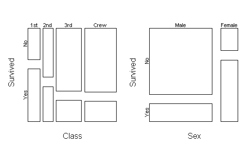
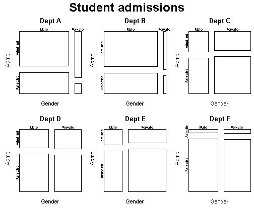
Upper classes were
located higher on the ship, which may have aided their survival.
Women and children were more prevalent in the upper classes, so does
this explain away the sex and age effect? To answer this question,
can stratify the data across class and then plot the relationship
between age and survival:
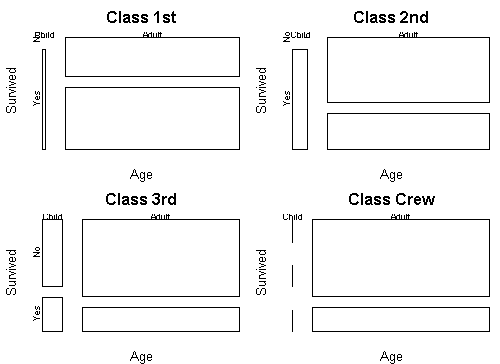
This shows that children had a higher survival rate within each class.
Here is a mosaic plot, with residual shading, of hair color versus eye
color in a group of statistics students (the HairEyeColor
dataset in R):
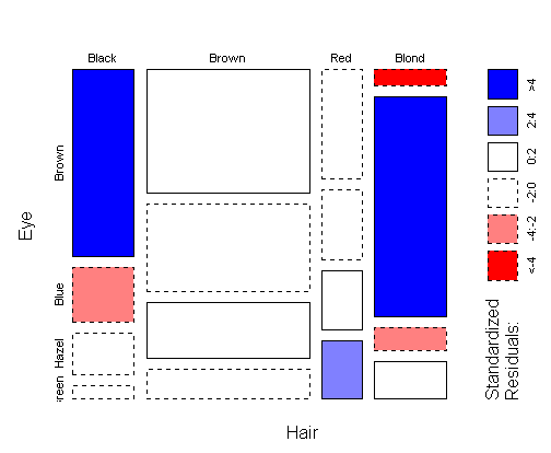
The residuals can be interpreted in the following way: a cell is shaded
blue if we are confident that it is taller than the other
cells in the same row. A cell is shaded red if we are confident
that it is shorter than the other cells in the same row.
If a cell is visibly short, but does not get shaded red, then there
is not enough data to conclude that the cell would continue to be short
if we took another sample.
A blue cell is usually accompanied by a red cell in the same row, but not
always---see e.g. the bottom row of the plot (green eyes).
Note that shading does not say anything about
the relative height of boxes in the same
column.
For a table with lots of data, shading is redundant because all differences are significant and can be seen from the box heights. However, heights can be difficult to compare when boxes aren't lined up, as in the "hazel eyes" row. Also, shading helps draw your eye to where the major associations are.
One problem with the mosaic plot in this context is that when a proportion is very small, the corresponding box is nearly invisible and you don't see that it is colored red. Unusually large cells are emphasized in a mosaic plot, while unusually small cells are hidden.
Contingency tables are created from factor variables, using the table command. Recall that a factor is a vector of categorical observations. Here is an example:
Pet <- factor(c("Cat","Dog","Cat","Dog","Cat","Dog"))
Food <- factor(c("Dry","Dry","Dry","Wet","Wet","Dry"))
x <- table(Pet,Food)
Now x is a contingency table containing counts of each
combination of a Pet category with a Food category:
     Food
Pet   Dry Wet
  Cat   2   1
  Dog   2   1
The transpose of this table is obtained via the t function,
e.g. t(x):
     Pet
Food  Cat Dog
  Dry   2   2
  Wet   1   1
To save a table to disk, use write.crosstab(x,"filename"). To read it back, use read.crosstab("filename"). The table is stored in an easy-to-read format.
You can perform a classical chi-square test with chisq.test(x). The expected counts under independence can be obtained with indep.fit(x). The marginal counts can be obtained with margin.table(x,k) or equivalently apply(x,k,sum). k is a number where 1 means the row variable and 2 means the column variable.
To make a mosaicplot of a table x, say mosaicplot(x). To make a mosaicplot with residual shading, say mosaicplot(x,shade=T).